


最新下载


热门教程
- 1
- 2
- 3
- 4
- 5
- 6
- 7
- 8
- 9
- 10
CSS3如何实现火焰动画 CSS3实现火焰动画代码示例
时间:2020-12-11 编辑:袖梨 来源:一聚教程网
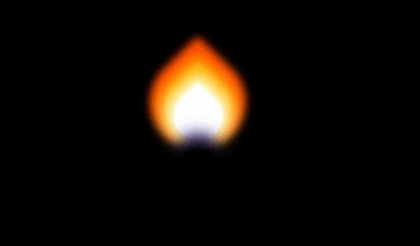
CSS3如何实现火焰动画?本篇文章小编给大家分享一下CSS3实现火焰动画代码示例,文章代码介绍的很详细,小编觉得挺不错的,现在分享给大家供大家参考,有需要的小伙伴们可以来看看。
实现效果
实现代码
html
CSS3
css;">body{
  background:black;
}

.container{
  margin:80px auto;


  position:relative;
  transform-origin:center bottom;
  animation-name: flicker;
  animation-duration:3ms;
  animation-delay:200ms;
  animation-timing-function: ease-in;
  animation-iteration-count: infinite;
  animation-direction: alternate;
}

.flame{
  bottom:0;
  position:absolute;
  border-bottom-right-radius: 50%;
  border-bottom-left-radius: 50%;
  border-top-left-radius: 50%;
  transform:rotate(-45deg) scale(1.5,1.5);
}

.yellow{
  left:15px;


  background:gold;
  box-shadow: 0px 0px 9px 4px gold;
}

.orange{
  left:10px;


  background:orange;
  box-shadow: 0px 0px 9px 4px orange;
}

.red{
  left:5px;


  background:OrangeRed;
  box-shadow: 0px 0px 5px 4px OrangeRed;
}

.white{
  left:15px;
  bottom:-4px;


  background:white;
  box-shadow: 0px 0px 9px 4px white;
}

.circle{
  border-radius: 50%;
  position:absolute;
}

.blue{


  left:25px;
  bottom:-25px;
  background: SlateBlue;
  box-shadow: 0px 0px 15px 10px SlateBlue;
}

.black{


  left:10px;
  bottom:-60px;
  background: black;
  box-shadow: 0px 0px 15px 10px black;
}

@keyframes flicker{
  0%   {transform: rotate(-1deg);}
  20%  {transform: rotate(1deg);}
  40%  {transform: rotate(-1deg);}
  60%  {transform: rotate(1deg) scaleY(1.04);}
  80%  {transform: rotate(-2deg) scaleY(0.92);}
  100% {transform: rotate(1deg);}
}
相关文章
- css3中仿放大镜效果的几种方式原理介绍 10-26
- CSS3切割轮播图的代码展示 10-26
- css3制作背景渐变动画效果教程 10-26
- CSS3呈现的定价表 09-16
- CSS3如何制作彩虹按钮样式 09-16
- CSS3图片悬停的切换按钮介绍 09-16