


最新下载


热门教程
- 1
- 2
- 3
- 4
- 5
- 6
- 7
- 8
- 9
- 10
CSS3通过var()和calc()函数实现动画特效代码示例
时间:2021-04-02 编辑:袖梨 来源:一聚教程网
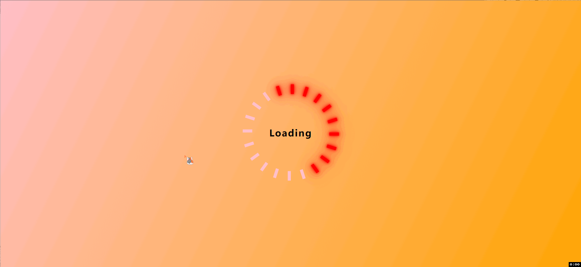
本篇文章小编给大家分享一下CSS3通过var()和calc()函数实现动画特效代码示例,文章代码介绍的很详细,小编觉得挺不错的,现在分享给大家供大家参考,有需要的小伙伴们可以来看看。
预习知识点.
动画帧
背景渐变
var() 和 calc() 的使用
flex布局的场景
Start:
创建HTML结构:
css;">
因为我们要转圈圈, 所以需要20个小盒子来组成我们的圈盒子,里面加上 style 样式: --i :num 这样我们获取到后面的数值.
盒子居中:
*{
      margin: 0;
      padding: 0;
      box-sizing: border-box;
    }
  section{
    display:flex;
    justify-content: center;
    align-items: center;
    min-height: 100vh;
    background: -webkit-linear-gradient(left top, pink, orange);
  }
使用 flex 布局, 讲盒子定位到正中央的位置,
background: -webkit-pnear-gradient(left top, pink, orange);
这个是渐变背景.
设置 loading 盒子大小.
.loading{
    position: relative;


  }
定位loading 盒子里面的文本和圈盒子.
.loading .text::after{
    content: "Loading";
    position: absolute;
    top: 50%;
    left: 50%;
    transform: translate(-50%, -50%);
    color: #000;
    font-size: 24px;
    font-weight:600;


    text-align: center;
    line-
    transition: all .5s;
    letter-spacing: 2px;
  }
.loading .clock{
    position:absolute;
    left: 50%;


    background-color:red;
    transform: rotate(calc(18deg * var(--i)));
    transform-origin: 0 125px;
    animation: clock 1.2s linear infinite;
    animation-delay: calc(0.06s * var(--i));
  }
通过 var (–i) 我们就可以获取到 该标签 style 里面 i 的num值,
度数的计算 360 / 20 = 18 deg 因为我们是20个圈盒子, 每个旋转 18deg,之后的都叠加旋转, 就可以达到这个效果。 但是如果不更改旋转的位置, 那么就会绕着圈盒子的正中央直接进行旋转, 不会散开,而直接构成一个圆。
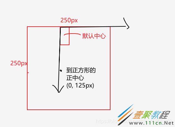
圈盒子的旋转定位 就是这样来的。
定义动画,添加动画
@keyframes clock {
    0%, 50%{
      background-color:pink;
      box-shadow: none;
    }
    50.1%, 100%{
      background-color: red;
      box-shadow: 0 0 5px red,
                  0 0 10px red,
                  0 0 25px red,
                  0 0 40px red;
    }
  }
transform-origin: 0 125px;
    animation: clock 1.2s linear infinite;
    animation-delay: calc(0.06s * var(--i));
对应盒子阴影, 可以设置多个值, 这样更炫.
加上Hover事件 停止动画
loading .text:hover::after{
    content: "Ended";
    transform:  translate(-50%, -50%) translateY(-8px) scale(1.3);
    color: red;
  }
  .loading:hover .clock{
    animation-play-state: paused;
  }
-
上一个: 原生CSS实现文字无限轮播通用方法代码
-
下一个: CSS3实现模糊背景的三种效果代码示例
相关文章
- css3中仿放大镜效果的几种方式原理介绍 10-26
- CSS3切割轮播图的代码展示 10-26
- css3制作背景渐变动画效果教程 10-26
- CSS3呈现的定价表 09-16
- CSS3如何制作彩虹按钮样式 09-16
- CSS3图片悬停的切换按钮介绍 09-16