


最新下载


热门教程
- 1
- 2
- 3
- 4
- 5
- 6
- 7
- 8
- 9
- 10
CSS3响应式设计Media Queries模板
时间:2014-10-15 编辑:简简单单 来源:一聚教程网
CSS3 Media Queries模板
CSS3 Media Queries一般都是使用“max-width”和“min-width”两个属性来检查各种设备的分辨大小与样式表所设条件是否满足,如果满足就调用相应的样式。打个比方来说,如果你的Web页面在960px的显屏下显示,那么首先会通过CSS3 Media Queries进行查询,看看有没有设置这个条件样式,如果找到相应的,就会采用对应下的样式,其他的设备是一样的道理。下面具体看看“max-width”和“min-width”模板:
使用max-width
@media screen and (max-) {
//你的样式放在这里....
}
使用min-width
@media screen and (min-) {
//你的样式放在这里...
}
max-width和min-width的混合使用
@media screen and (min-) and (max-) {
//你的样式放在这里...
}
同时CSS3 Media Queries还能查询设备的宽度“device-width”来判断样式的调用,这个主要用在iPhone,iPads设备上,比如像下面的应用:
iPhone和Smartphones上的运用
/* iPhone and Smartphones (portrait and landscape) */
@media screen and (min-device-) and (max-device-) {
//你的样式放在这里...
}
max-device-width指的是设备整个渲染区宽度(设备的实际宽度)
iPads上的运用
/* iPads (landscape) */
@media screen and (min-device-) and (max-device-) and (orientation : landscape) {
//你的样式放在这里...
}
/* iPads (portrait) */
@media screen and (min-device-) and (max-device-) and (orientation : portrait) {
//你的样式放在这里...
}
针对移动设备的运用,如果你想让样式工作得比较正常,需要在“”添加“viewport”的meta标签:
css" />
CSS3 Media Queries在标准设备上的运用
下面我们一起来看看CSS3 Meida Queries在标准设备上的运用,大家可以把这些样式加到你的样式文件中,或者单独创建一个名为“responsive.css”文件,并在相应的条件中写上你的样式,让他适合你的设计需求:
1、1024px显屏
@media screen and (max-) {
/* CSS Styles */
}
2、800px显屏
@media screen and (max-) {
/* CSS Styles */
}
3、640px显屏
@media screen and (max-) {
/* CSS Styles */
}
4、iPad横板显屏
@media screen and (max-device-) and (orientation: landscape) {
/* CSS Styles */
}
5、iPad竖板显屏
@media screen and (max-device-) and (orientation: portrait) {
/* CSS Styles */
}
iPhone 和 Smartphones
@media screen and (min-device-) and (min-device-) {
/* CSS Styles */
}
现在有关于这方面的运用也是相当的成熟,twitter的Bootstrap第二版本中就加上了这方面的运用。大家可以对比一下:
// Landscape phones and down
@media (max-) { ... }
// Landscape phone to portrait tablet
@media (max-) { ... }
// Portrait tablet to landscape and desktop
@media (min-) and (max-) { ... }
// Large desktop
@media (min-) { .. }
在bootstrap中的responsive.css采用的是网格布局,大家可以到官网查看或下载其源码进行学习。另外为大家提供了一个Adapt.js也很方便的帮大家实现上述效果。感兴趣的同学可以去了解了解。
1、Smartphones (portrait and landscape)
@media only screen and (min-device-) and (max-device-) {
/* Styles */
}
2、Smartphones (landscape)
@media only screen and (min-) {
/* Styles */
}
3、Smartphones (portrait)
@media only screen and (max-) {
/* Styles */
}
4、iPads (portrait and landscape)
@media only screen and (min-device-) and (max-device-) {
/* Styles */
}
5、iPads (landscape)
@media only screen and (min-device-) and (max-device-) and (orientation : landscape) {
/* Styles */
}
6、iPads (portrait)
@media only screen and (min-device-) and (max-device-) and (orientation : portrait) {
/* Styles */
}
7、iPhone 4
@media only screen and (-webkit-min-device-pixel-ratio : 1.5),only screen and (min-device-pixel-ratio : 1.5) {
/* Styles */
}
8、640px显屏
@media screen and (max-) {
/* CSS Styles */
}
9、800px显屏
@media screen and (max-) {
/* CSS Styles */
}
10、1024显屏
@media screen and (max-) {
/* CSS Styles */
}
11、Desktops and laptops
@media only screen and (min-) {
/* Styles */
}
12、Large screens
@media only screen and (min-) {
/* Styles */
}
那么有关于CSS3 Media Queries模板的相关介绍就说到这里了,最后希望大家喜欢。如果你觉得这篇文章对你有所帮助或者比较有实用价值,您可以把他推荐给您的朋友,如果你有更好的分享可以在下面的评论中直接与我们一起分享您的经验。
最新更新模板
@media only screen and (min-) {
/* Small screen, non-retina */
}
@media
only screen and (-webkit-min-device-pixel-ratio: 2) and (min-),
only screen and ( min--moz-device-pixel-ratio: 2) and (min-),
only screen and ( -o-min-device-pixel-ratio: 2/1) and (min-),
only screen and ( min-device-pixel-ratio: 2) and (min-),
only screen and ( min-resolution: 192dpi) and (min-),
only screen and ( min-resolution: 2dppx) and (min-) {
/* Small screen, retina, stuff to override above media query */
}
@media only screen and (min-) {
/* Medium screen, non-retina */
}
@media
only screen and (-webkit-min-device-pixel-ratio: 2) and (min-),
only screen and ( min--moz-device-pixel-ratio: 2) and (min-),
only screen and ( -o-min-device-pixel-ratio: 2/1) and (min-),
only screen and ( min-device-pixel-ratio: 2) and (min-),
only screen and ( min-resolution: 192dpi) and (min-),
only screen and ( min-resolution: 2dppx) and (min-) {
/* Medium screen, retina, stuff to override above media query */
}
@media only screen and (min-) {
/* Large screen, non-retina */
}
@media
only screen and (-webkit-min-device-pixel-ratio: 2) and (min-),
only screen and ( min--moz-device-pixel-ratio: 2) and (min-),
only screen and ( -o-min-device-pixel-ratio: 2/1) and (min-),
only screen and ( min-device-pixel-ratio: 2) and (min-),
only screen and ( min-resolution: 192dpi) and (min-),
only screen and ( min-resolution: 2dppx) and (min-) {
/* Large screen, retina, stuff to override above media query */
}
media query中的not only all等关键字
今天在群里一群友问起 @media only screen and (min-) 中only是什么意思,查了些资料。
not: not是用来排除掉某些特定的设备的,比如 @media not print(非打印设备)、
only: 用来定某种特别的媒体类型。对于支持Media Queries的移动设备来说,如果存在only关键字,移动设备的Web浏览器会忽略only关键字并直接根据后面的表达式应用样式文件。对于不支持Media Queries的设备但能够读取Media Type类型的Web浏览器,遇到only关键字时会忽略这个样式文件。
all: 所有设备,这个应该经常看到
还有其它一些:
|
media_type
|
设备类型说明
|
|
all
|
所有设备
|
|
aural
|
听觉设备
|
|
braille
|
点字触觉设备
|
|
handled
|
便携设备,如手机、平板电脑
|
|
print
|
打印预览图等
|
|
projection
|
投影设备
|
|
screen
|
显示器、笔记本、移动端等设备
|
|
tty
|
如打字机或终端等设备
|
|
tv
|
电视机等设备类型
|
|
embossed
|
盲文打印机
|
实现响应式网页设计例子
第一步:Meta标签(查看演示)
大多数移动浏览器将HTML页面放大为宽的视图(viewport)以符合屏幕分辨率。你可以使用视图的meta标签来进行重置。下面的视图标签告诉浏览器,使用设备的宽度作为视图宽度并禁止初始的缩放。在标签里加入这个meta标签。
< ![endif]-->
第二步:HTML结构
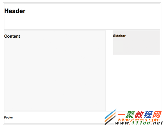
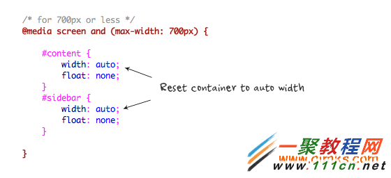
CSS3 Media Query-媒介查询是响应式设计的核心。它根据条件告诉浏览器如何为指定视图宽度渲染页面。
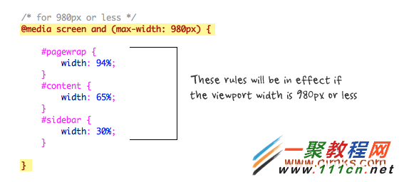
当视图宽度为小于等于980像素时,如下规则将会生效。基本上,我会将所有的容器宽度从像素值设置为百分比以使得容器大小自适应。

-
下一个: 网站使用苹果的pinghei字体的方法
相关文章
- 用CSS3来实现逐渐发光的方格边框 05-17
- CSS3背景下的@font face有什么规则 05-06
- 详解CSS3中nth-child与nth-of-type的区别 01-10
- CSS3,线性渐变(linear-gradient)的使用总结 01-10
- CSS3动画特效制作教程 好看的CSS3动画特效 01-04
- CSS3 Flexbox属性用法大全 CSS3 Flexbox各种属性详解 01-04