


最新下载


热门教程
- 1
- 2
- 3
- 4
- 5
- 6
- 7
- 8
- 9
- 10
Python科学画图代码分享
时间:2017-12-19 编辑:猪哥 来源:一聚教程网
Python画图主要用到matplotlib这个库。Matplotlib 是一个 Python 的 2D绘图库,它以各种硬拷贝格式和跨平台的交互式环境生成出版质量级别的图形。
具体来说是pylab和pyplot这两个子库。这两个库可以满足基本的画图需求,而条形图,散点图等特殊图,下面再单独具体介绍。
首先给出pylab神器镇文:pylab.rcParams.update(params)。这个函数几乎可以调节图的一切属性,包括但不限于:坐标范围,axes标签字号大小,xtick,ytick标签字号,图线宽,legend字号等。
具体参数参看官方文档:http://matplotlib.org/users/customizing.html
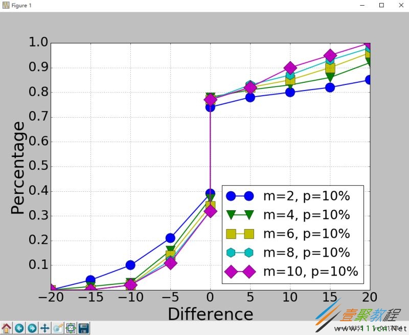
首先给出一个Python3画图的例子。
import matplotlib.pyplot as plt
import matplotlib.pylab as pylab
import scipy.io
import numpy as np
params={
  'axes.labelsize': '35',
  'xtick.labelsize':'27',
  'ytick.labelsize':'27',
  'lines.linewidth':2 ,
  'legend.fontsize': '27',
  'figure.figsize'  : '12, 9'  # set figure size
}
pylab.rcParams.update(params)      #set figure parameter
#line_styles=['ro-','b^-','gs-','ro--','b^--','gs--'] #set line style

#We give the coordinate date directly to give an example.
x1 = [-20,-15,-10,-5,0,0,5,10,15,20]
y1 = [0,0.04,0.1,0.21,0.39,0.74,0.78,0.80,0.82,0.85]
y2 = [0,0.014,0.03,0.16,0.37,0.78,0.81,0.83,0.86,0.92]
y3 = [0,0.001,0.02,0.14,0.34,0.77,0.82,0.85,0.90,0.96]
y4 = [0,0,0.02,0.12,0.32,0.77,0.83,0.87,0.93,0.98]
y5 = [0,0,0.02,0.11,0.32,0.77,0.82,0.90,0.95,1]


plt.plot(x1,y1,'bo-',label='m=2, p=10%',markersize=20) # in 'bo-', b is blue, o is O marker, - is solid line and so on
plt.plot(x1,y2,'gv-',label='m=4, p=10%',markersize=20)
plt.plot(x1,y3,'ys-',label='m=6, p=10%',markersize=20)
plt.plot(x1,y4,'ch-',label='m=8, p=10%',markersize=20)
plt.plot(x1,y5,'mD-',label='m=10, p=10%',markersize=20)


fig1 = plt.figure(1)
axes = plt.subplot(111)
#axes = plt.gca()
axes.set_yticks([0.1,0.2,0.3,0.4,0.5,0.6,0.7,0.8,0.9,1.0])
axes.grid(True) # add grid

plt.legend(loc="lower right") #set legend location
plt.ylabel('Percentage')  # set ystick label
plt.xlabel('Difference') # set xstck label

plt.savefig('D:\commonNeighbors_CDF_snapshots.eps',dpi = 1000,bbox_inches='tight')
plt.show()
显示效果如下:
代码没什么好说的,这里只说一下plt.subplot(111)这个函数。
plt.subplot(111)和plt.subplot(1,1,1)是等价的。意思是将区域分成1行1列,当前画的是第一个图(排序由行至列)。
plt.subplot(211)意思就是将区域分成2行1列,当前画的是第一个图(第一行,第一列)。以此类推,只要不超过10,逗号就可省去。
python画条形图。代码如下。
import scipy.io
import numpy as np
import matplotlib.pylab as pylab
import matplotlib.pyplot as plt
import matplotlib.ticker as mtick
params={
  'axes.labelsize': '35',
  'xtick.labelsize':'27',
  'ytick.labelsize':'27',
  'lines.linewidth':2 ,
  'legend.fontsize': '27',
  'figure.figsize'  : '24, 9'
}
pylab.rcParams.update(params)


y1 = [9.79,7.25,7.24,4.78,4.20]
y2 = [5.88,4.55,4.25,3.78,3.92]
y3 = [4.69,4.04,3.84,3.85,4.0]
y4 = [4.45,3.96,3.82,3.80,3.79]
y5 = [3.82,3.89,3.89,3.78,3.77]

ind = np.arange(5)        # the x locations for the groups
.15
plt.bar(ind,y1,width,color = 'blue',label = 'm=2')
plt.bar(ind+width,y2,width,color = 'g',label = 'm=4') # ind+width adjusts the left start location of the bar.
plt.bar(ind+2*width,y3,width,color = 'c',label = 'm=6')
plt.bar(ind+3*width,y4,width,color = 'r',label = 'm=8')
plt.bar(ind+4*width,y5,width,color = 'm',label = 'm=10')
plt.xticks(np.arange(5) + 2.5*width, ('10%','15%','20%','25%','30%'))

plt.xlabel('Sample percentage')
plt.ylabel('Error rate')

fmt = '%.0f%%' # Format you want the ticks, e.g. '40%'
xticks = mtick.FormatStrFormatter(fmt)
# Set the formatter
axes = plt.gca()  # get current axes
axes.yaxis.set_major_formatter(xticks) # set % format to ystick.
axes.grid(True)
plt.legend(loc="upper right")
plt.savefig('D:\errorRate.eps', format='eps',dpi = 1000,bbox_inches='tight')

plt.show()
结果如下:

画散点图,主要是scatter这个函数,其他类似。
画网络图,要用到networkx这个库,下面给出一个实例:
import networkx as nx
import pylab as plt
g = nx.Graph()
g.add_edge(1,2,weight = 4)
g.add_edge(1,3,weight = 7)
g.add_edge(1,4,weight = 8)
g.add_edge(1,5,weight = 3)
g.add_edge(1,9,weight = 3)

g.add_edge(1,6,weight = 6)
g.add_edge(6,7,weight = 7)
g.add_edge(6,8,weight = 7)

g.add_edge(6,9,weight = 6)
g.add_edge(9,10,weight = 7)
g.add_edge(9,11,weight = 6)

fixed_pos = {1:(1,1),2:(0.7,2.2),3:(0,1.8),4:(1.6,2.3),5:(2,0.8),6:(-0.6,-0.6),7:(-1.3,0.8), 8:(-1.5,-1), 9:(0.5,-1.5), 10:(1.7,-0.8), 11:(1.5,-2.3)} #set fixed layout location

#pos=nx.spring_layout(g) # or you can use other layout set in the module
nx.draw_networkx_nodes(g,pos = fixed_pos,nodelist=[1,2,3,4,5],
node_color = 'g',node_size = 600)
nx.draw_networkx_edges(g,pos = fixed_pos,edgelist=[(1,2),(1,3),(1,4),(1,5),(1,9)],edge_color='g',width = [4.0,4.0,4.0,4.0,4.0],label = [1,2,3,4,5],node_size = 600)

nx.draw_networkx_nodes(g,pos = fixed_pos,nodelist=[6,7,8],
node_color = 'r',node_size = 600)
nx.draw_networkx_edges(g,pos = fixed_pos,edgelist=[(6,7),(6,8),(1,6)],r',node_size = 600)

nx.draw_networkx_nodes(g,pos = fixed_pos,nodelist=[9,10,11],
node_color = 'b',node_size = 600)
nx.draw_networkx_edges(g,pos = fixed_pos,edgelist=[(6,9),(9,10),(9,11)],b',node_size = 600)

plt.text(fixed_pos[1][0],fixed_pos[1][1]+0.2, s = '1',fontsize = 40)
plt.text(fixed_pos[2][0],fixed_pos[2][1]+0.2, s = '2',fontsize = 40)
plt.text(fixed_pos[3][0],fixed_pos[3][1]+0.2, s = '3',fontsize = 40)
plt.text(fixed_pos[4][0],fixed_pos[4][1]+0.2, s = '4',fontsize = 40)
plt.text(fixed_pos[5][0],fixed_pos[5][1]+0.2, s = '5',fontsize = 40)
plt.text(fixed_pos[6][0],fixed_pos[6][1]+0.2, s = '6',fontsize = 40)
plt.text(fixed_pos[7][0],fixed_pos[7][1]+0.2, s = '7',fontsize = 40)
plt.text(fixed_pos[8][0],fixed_pos[8][1]+0.2, s = '8',fontsize = 40)
plt.text(fixed_pos[9][0],fixed_pos[9][1]+0.2, s = '9',fontsize = 40)
plt.text(fixed_pos[10][0],fixed_pos[10][1]+0.2, s = '10',fontsize = 40)
plt.text(fixed_pos[11][0],fixed_pos[11][1]+0.2, s = '11',fontsize = 40)

plt.show()
结果如下:

相关文章
- Golang ProtoBuf的基本语法详解 10-20
- Python识别MySQL中的冗余索引解析 10-20
- Python+Pygame绘制小球代码展示 10-18
- Python中的数据精度问题介绍 10-18
- Python随机值生成的常用方法介绍 10-18
- python3解压缩.gz文件分析 09-27