


最新下载


热门教程
- 1
- 2
- 3
- 4
- 5
- 6
- 7
- 8
- 9
- 10
python离散点图画法代码实现方法
时间:2022-04-01 编辑:袖梨 来源:一聚教程网
本篇文章小编给大家分享一下python离散点图画法代码实现方法,文章代码介绍的很详细,小编觉得挺不错的,现在分享给大家供大家参考,有需要的小伙伴们可以来看看。
基础代码
pred_y = test_output.data.numpy()
pred_y = pred_y.flatten()
print(pred_y, 'prediction number')
print(test_y[:355].numpy(), 'real number')

import matplotlib.pyplot as plt
plt.rc("font", family='KaiTi')
plt.figure()
f, axes = plt.subplots(1, 1)
x = np.arange(1, 356)
# axes.plot(x , pred_y)
axes.scatter(x,pred_y, c='r', marker = 'o')
plt.axhline(36.7, c ='g')
axes.set_xlabel("位置点位")
axes.set_ylabel("预测值")
axes.set_title("矫正网络结果")
plt.savefig("result.png")
plt.show()
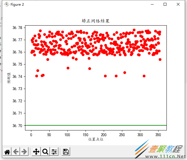
离散图画法如上所示。
改进

import matplotlib.pyplot as plt
plt.rc("font", family='KaiTi')
plt.figure()
f, axes = plt.subplots(1, 1)
x = np.arange(1, 356)
# axes.plot(x , pred_y)
axes.scatter(x, pred_y, c='r', marker = 'o')
plt.axhline(36.7, c ='g')
axes.set_xlabel("位置点位")
axes.set_ylabel("预测值")
axes.set_title("矫正网络预测结果")
axes.set_ylim((36, 37))
plt.savefig("result.png")
plt.show()
再次改进:

import matplotlib.pyplot as plt
plt.rc("font", family='KaiTi')
plt.figure()
f, axes = plt.subplots(1, 1)
x = np.arange(1, 356)
# axes.plot(x , pred_y)
axes.scatter(x, pred_y, c='r', marker = 'o')
plt.axhline(36.7, c ='g')
axes.set_xlabel("位置点位")
axes.set_ylabel("预测值")
axes.set_title("矫正网络预测结果")
axes.set_ylim((36, 37))
plt.savefig("result.png")
plt.legend(['real', 'predict'], loc='upper left')
plt.show()
又次改进:

import matplotlib.pyplot as plt
plt.rc("font", family='KaiTi')
plt.figure()
f, axes = plt.subplots(1, 1)
x = np.arange(1, 356)
# axes.plot(x , pred_y)
axes.scatter(x, pred_y, c='r', s=3, marker = 'o')
plt.axhline(36.7, c ='g')
axes.set_xlabel("位置点位")
axes.set_ylabel("预测值")
axes.set_title("矫正网络预测结果")
axes.set_ylim((36, 37))
plt.savefig("result.png")
plt.legend(['真实值36.7℃', '预测值'], loc='upper left')
plt.show()
改进:----加准确率

import matplotlib.pyplot as plt
plt.rc("font", family='KaiTi')
plt.figure()
f, axes = plt.subplots(1, 1)
x = np.arange(1, 356)
# axes.plot(x , pred_y)
axes.scatter(x, pred_y, c='r', s=3, marker = 'o')
plt.axhline(36.7, c ='g')
axes.set_xlabel("位置点位")
axes.set_ylabel("预测值")
axes.set_title("矫正网络预测结果")
axes.set_ylim((36, 37))
plt.savefig("result.png")
plt.legend(['真实值36.7℃', '预测值'], loc='upper left')

row_labels = ['准确率:']
col_labels = ['数值']
table_vals = [['{:.2f}%'.format(v*100)]]
row_colors = ['gold']
my_table = plt.table(cellText=table_vals, colWidths=[0.1] * 5,
                             rowLabels=row_labels, rowColours=row_colors, loc='best')
plt.show()
相关文章
- Golang ProtoBuf的基本语法详解 10-20
- Python识别MySQL中的冗余索引解析 10-20
- Python+Pygame绘制小球代码展示 10-18
- Python中的数据精度问题介绍 10-18
- Python随机值生成的常用方法介绍 10-18
- python3解压缩.gz文件分析 09-27