


最新下载


热门教程
- 1
- 2
- 3
- 4
- 5
- 6
- 7
- 8
- 9
- 10
Swift实现自由调整图标按钮中的图标和文字位置(扩展UIButton)
时间:2015-12-25 编辑:简简单单 来源:一聚教程网
按钮UIButton是ios开发中最常见的控件之一,下面来介绍UIButton的详细内容,及开发中需要注意的问题。
UIButton简介:
使用目标动作设计模式,target-action模式,3种回调的模式之一。
实现原理:
使用下面的方法封装,根据用户的点击移动等动作
- (void)touchesBegan:(NSSet *)touches withEvent:(UIEvent *)event;
- (void)touchesMoved:(NSSet *)touches withEvent:(UIEvent *)event;
- (void)touchesEnded:(NSSet *)touches withEvent:(UIEvent *)event;
- (void)touchesCancelled:(NSSet *)touches withEvent:(UIEvent *)event;创建按钮:
//构造器方法,调用该方法创建某个样式的按钮对象
+ (id)buttonWithType:(UIButtonType)buttonType
参数:
buttonType:按钮样式
枚举值:
UIButtonTypeCustom = 0, 自定义风格UIButtonTypeRoundedRect, 圆角矩形
UIButtonTypeDetailDisclosure, 蓝色小箭头按钮,主要做详细说明用
UIButtonTypeInfoLight, 亮色感叹号
UIButtonTypeInfoDark, 暗色感叹号
UIButtonTypeContactAdd, 十字加号按钮UIButtonTypeSystem ,系统默认样式,若使用此样式,在使用setImage时会显示异常
示例:
UIButton *button = [UIButton buttonWithType:UIButtonTypeRoundedRect];
配置按钮标题
//获取按钮的标题文字,只读属性
@property(nonatomic, readonly, retain) UILabel *titleLabel,注意请勿直接使用titleLabel来修改title
//返回在某个状态下,按钮的标题文字
- (NSString *)titleForState:(UIControlState)state
参数:
state:控件状态
枚举值:
UIControlStateNormal //常规状态显现
UIControlStateHighlighted //高亮状态显现
UIControlStateDisabled //禁用的状态才会显现
UIControlStateSelected //选中状态 UIControlStateApplication //当应用程序标志时
UIControlStateReserved //为内部框架预留,可以不管他
返回值:此状态下按钮的标题文字
示例:
NSString *title = [button titleForState:UIControlStateNormal];
//设置按钮在某个状态下的标题文字
- (void)setTitle:(NSString *)title
forState:(UIControlState)state
示例:
[button setTitle:@"按钮" forState:UIControlStateNormal];
//返回在某个状态下,按钮标题的富文本
- (NSAttributedString *)attributedTitleForState:(UIControlState)state
参数:
state:控件的状态
返回值:富文本
NSAttirbutedString 为富文本,详情参见NSAttirbutedString文档
示例:
NSAttributedString *attributedString = [button attributedTitleForState:UIControlStateNormal];
//设值按钮在某个状态下的富文本标题
- (void)setAttributedTitle:(NSAttributedString *)title
forState:(UIControlState)state
//返回按钮在某个状态下的标题颜色
- (UIColor *)titleColorForState:(UIControlState)state
参数:
state:状态
返回值:颜色
示例:
UIColor *color = [button titleColorForState:UIControlStateNormal];
//设置按钮标题的颜色
- (void)setTitleColor:(UIColor *)color
forState:(UIControlState)state
参数:
color:颜色描述对象
state:状态
示例:
[button setTitleColor:[UIColor redColor] forState:UIControlStateNormal];
//返回某个状态下按钮标题的阴影颜色
- (UIColor *)titleShadowColorForState:(UIControlState)state
//设置某个状态下按钮标题的阴影颜色
- (void)setTitleShadowColor:(UIColor *)color
forState:(UIControlState)state
参数:
color:颜色描述对象
state:状态
示例:
[button setTitleShadowColor:[UIColor grayColor] forState:UIControlStateNormal];
//标题的阴影改变时,按钮是否高亮显示。默认为NO
@property(nonatomic) BOOL reversesTitleShadowWhenHighlighted
配置按钮演示
//按钮高亮的情况下,图像的颜色是否要加深一点。默认是YES
@property(nonatomic) BOOL adjustsImageWhenHighlighted
//按钮禁用的情况下,图像的颜色是否要加深一点。默认是YES
@property(nonatomic) BOOL adjustsImageWhenDisabled
//按下按钮是否会发光。默认是NO
@property(nonatomic) BOOL showsTouchWhenHighlighted
//返回按钮在某个状态下的背景图片
- (UIImage *)backgroundImageForState:(UIControlState)state
参数:
state:状态
返回值:背景图像
示例:
UIImage *image = [button backgroundImageForState:UIControlStateNormal];
//获取按钮的填充图片
- (UIImage *)imageForState:(UIControlState)state
//设置按钮的背景图片
- (void)setBackgroundImage:(UIImage *)image
forState:(UIControlState)state
参数:
image:背景图片
state:状态
示例:
[button setBackgroundImage:image forState:UIControlStateNormal];
//设置按钮的填充图片
- (void)setImage:(UIImage *)image
forState:(UIControlState)state
配置按钮边框效果
//设置按钮的内部内容(包含按钮图片和标题)离按钮边缘上下左右的距离。
@property(nonatomic) UIEdgeInsets contentEdgeInsets
结构体:
CGFloat top, left, bottom, right;
四个值,分别是上左下右
//设置按钮的内部标题离按钮边缘上下左右的距离
@property(nonatomic) UIEdgeInsets titleEdgeInsets
//设置按钮的内部图片离按钮边缘上下左右的距离
@property(nonatomic) UIEdgeInsets imageEdgeInsets
获取按钮当前状态(只读)
//获取按钮状态,只读属性
@property(nonatomic, readonly) UIButtonType buttonType
//获取按钮当前标题,只读属性
@property(nonatomic, readonly, retain) NSString *currentTitle
//获取按钮当前的富文本标题
@property(nonatomic, readonly, retain) NSAttributedString *currentAttributedTitle
//获取当前标题的颜色
@property(nonatomic, readonly, retain) UIColor *currentTitleColor
//获取当前标题的阴影颜色
@property(nonatomic, readonly, retain) UIColor *currentTitleShadowColor
//获取当前按钮的图片
@property(nonatomic, readonly, retain) UIImage *currentImage
//获取当前按钮的背景图片
@property(nonatomic, readonly, retain) UIImage *currentBackgroundImage
//获取当前按钮的图片框对象
@property(nonatomic, readonly, retain) UIImageView *imageView
重写绘制行为
你可以通过子类化按钮来定制属于你自己的按钮类。在子类化的时候你可以重载下面这些方法,这些方法返回CGRect结构,指明了按钮每一组成部分的边界。
注意:不要直接调用这些方法, 这些方法是你写给系统调用的。
//指定背景边界
- (CGRect)backgroundRectForBounds:(CGRect)bounds
//指定内容边界
- (CGRect)contentRectForBounds:(CGRect)bounds
//指定文字标题边界
- (CGRect)titleRectForContentRect:(CGRect)contentRect
//指定按钮图像边界
- (CGRect)imageRectForContentRect:(CGRect)contentRect
示例:
- (CGRect)imageRectForContentRect:(CGRect)bounds{
return CGRectMake(0.0, 0.0, 44, 44);
}
事件
//给按钮添加点击事件
[button addTarget:self action:@selector(action:) forControlEvents:UIControlEventTouchUpInside];
枚举值:
UIControlEventTouchDown // 单点触摸按下事件:用户点触屏幕,或者又有新手指落下的时候。
UIControlEventTouchDownRepeat // 多点触摸按下事件,点触计数大于1:用户按下第二、三、或第四根手指的时候。
UIControlEventTouchDragInside // 当一次触摸在控件窗口内拖动时。
UIControlEventTouchDragOutside // 当一次触摸在控件窗口之外拖动时。
UIControlEventTouchDragEnter // 当一次触摸从控件窗口之外拖动到内部时
UIControlEventTouchDragExit // 当一次触摸从控件窗口内部拖动到外部时。
UIControlEventTouchUpInside // 所有在控件之内触摸抬起事件
UIControlEventTouchUpOutside // 所有在控件之外触摸抬起事件(点触必须开始与控件内部才会发送通知)。
UIControlEventTouchCancel //所有触摸取消事件,即一次触摸因为放上了太多手指而被取消,或者被上锁或者电话呼叫打断。
UIControlEventValueChanged // 当控件的值发生改变时,发送通知。用于滑块、分段控件、以及其他取值的控件。你可以配置滑块控件何时发送通知,在滑块被放下时发送,或者在被拖动时发送。
UIControlEventEditingDidBegin // 当文本控件中开始编辑时发送通知
UIControlEventEditingChanged // 当文本控件中的文本被改变时发送通知。
UIControlEventEditingDidEnd // 当文本控件中编辑结束时发送通知。
UIControlEventEditingDidEndOnExit // 当文本控件内通过按下回车键(或等价行为)结束编辑时,发送通知。
UIControlEventAllTouchEvents // 通知所有触摸事件。
UIControlEventAllEditingEvents // 通知所有关于文本编辑的事件。
UIControlEventApplicationReserved // range available for application use
UIControlEventSystemReserved // range reserved for internal framework use
UIControlEventAllEvents // 通知所有事件
复选框checkBox的实现:
首先给选中,何不选中的时候设置背景图片
点击按钮的时候,取反selected值即可
利用selected状态,反选即可
示例代码:
-(void)checkboxClick:(UIButton *)btn
{
btn.selected = !btn.selected;
}
- (void)viewDidLoad {
UIButton *checkbox = [UIButton buttonWithType:UIButtonTypeCustom];
CGRect checkboxRect = CGRectMake(135,150,36,36);
[checkbox setFrame:checkboxRect];
[checkbox setImage:[UIImage imageNamed:@"checkbox_off.png"] forState:UIControlStateNormal];
[checkbox setImage:[UIImage imageNamed:@"checkbox_on.png"] forState:UIControlStateSelected];
[checkbox addTarget:self action:@selector(checkboxClick:) forControlEvents:UIControlEventTouchUpInside];
[self.view addSubview:checkbox];
}
自由调整图标按钮中的图标和文字位置(扩展UIButton)
1,Custom类型的UIButton
我们使用定制类型(Custom)的按钮就可以设置文字前面的图标。但是图片和文字的相对位置是固定的(按钮在前,文字在后)。
(1)我们用下面的左图(64*64)制作一个带图标的按钮
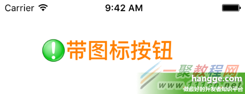
//创建一个图片加文字的按钮
let btn1:UIButton = UIButton(frame: CGRect(x: 50, y: 50, width: 180, height: 32))
btn1.setImage(UIImage(named: "alert"), forState: UIControlState.Normal) //按钮图标
btn1.titleLabel?.font = UIFont.boldSystemFontOfSize(28) //文字大小
btn1.setTitle("带图标按钮", forState: UIControlState.Normal) //按钮文字
btn1.setTitleColor(UIColor.orangeColor(), forState: UIControlState.Normal) //文字颜色
self.view.addSubview(btn1)
(2)图片与文字间的间距方式1 - 设置图片偏移量(imageEdgeInsets)
 1
1
btn1.imageEdgeInsets = UIEdgeInsets(top: 0, left: -20, bottom: 0, right: 0)
(3)图片与文字间的间距方式2 - 设置文字偏移量(titleEdgeInsets)

btn1.titleEdgeInsets= UIEdgeInsets(top: 0, left: 20, bottom: 0, right: 0)
2,扩展UIButton
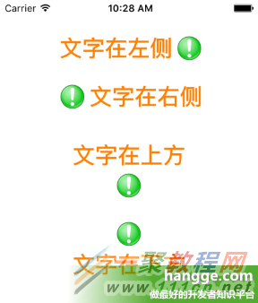
如果我们想要把文字和图片位置调换下(即文字在前、图片在后),或者文字和图片改成上下排列,那么同样通过设置 titleEdgeInsets 和 imageEdgeInsets 即可实现。
为方便快速的设置图片和文字的相对位置,以及间距,这里对UIButton进行扩展。
(1)扩展代码如下:
import UIKit
extension UIButton {
@objc func set(image anImage: UIImage?, title: String,
titlePosition: UIViewContentMode, additionalSpacing: CGFloat, state: UIControlState){
self.imageView?.contentMode = .Center
self.setImage(anImage, forState: state)
positionLabelRespectToImage(title, position: titlePosition, spacing: additionalSpacing)
self.titleLabel?.contentMode = .Center
self.setTitle(title, forState: state)
}
private func positionLabelRespectToImage(title: String, position: UIViewContentMode,
spacing: CGFloat) {
let imageSize = self.imageRectForContentRect(self.frame)
let titleFont = self.titleLabel?.font!
let titleSize = title.sizeWithAttributes([NSFontAttributeName: titleFont!])
var titleInsets: UIEdgeInsets
var imageInsets: UIEdgeInsets
switch (position){
case .Top:
titleInsets = UIEdgeInsets(top: -(imageSize.height + titleSize.height + spacing),
left: -(imageSize.width), bottom: 0, right: 0)
imageInsets = UIEdgeInsets(top: 0, left: 0, bottom: 0, right: -titleSize.width)
case .Bottom:
titleInsets = UIEdgeInsets(top: (imageSize.height + titleSize.height + spacing),
left: -(imageSize.width), bottom: 0, right: 0)
imageInsets = UIEdgeInsets(top: 0, left: 0, bottom: 0, right: -titleSize.width)
case .Left:
titleInsets = UIEdgeInsets(top: 0, left: -(imageSize.width * 2), bottom: 0, right: 0)
imageInsets = UIEdgeInsets(top: 0, left: 0, bottom: 0,
right: -(titleSize.width * 2 + spacing))
case .Right:
titleInsets = UIEdgeInsets(top: 0, left: 0, bottom: 0, right: -spacing)
imageInsets = UIEdgeInsets(top: 0, left: 0, bottom: 0, right: 0)
default:
titleInsets = UIEdgeInsets(top: 0, left: 0, bottom: 0, right: 0)
imageInsets = UIEdgeInsets(top: 0, left: 0, bottom: 0, right: 0)
}
self.titleEdgeInsets = titleInsets
self.imageEdgeInsets = imageInsets
}
}
(2)使用样例
import UIKit
class ViewController: UIViewController {
override func viewDidLoad() {
super.viewDidLoad()
let btn1:UIButton = UIButton(frame: CGRect(x: 0, y: 0, width: 200, height: 32))
btn1.center = CGPointMake(view.frame.size.width/2, 60)
btn1.titleLabel?.font = UIFont.boldSystemFontOfSize(28) //文字大小
btn1.setTitleColor(UIColor.orangeColor(), forState: UIControlState.Normal) //文字颜色
btn1.set(image: UIImage(named: "alert"), title: "文字在左侧", titlePosition: .Left,
additionalSpacing: 10.0, state: .Normal)
view.addSubview(btn1)
let btn2:UIButton = UIButton(frame: CGRect(x: 0, y: 0, width: 200, height: 32))
btn2.center = CGPointMake(view.frame.size.width/2, 120)
btn2.titleLabel?.font = UIFont.boldSystemFontOfSize(28) //文字大小
btn2.setTitleColor(UIColor.orangeColor(), forState: UIControlState.Normal) //文字颜色
btn2.set(image: UIImage(named: "alert"), title: "文字在右侧", titlePosition: .Right,
additionalSpacing: 10.0, state: .Normal)
view.addSubview(btn2)
let btn3:UIButton = UIButton(frame: CGRect(x: 0, y: 0, width: 170, height: 70))
btn3.center = CGPointMake(view.frame.size.width/2, 230)
btn3.titleLabel?.font = UIFont.boldSystemFontOfSize(28) //文字大小
btn3.setTitleColor(UIColor.orangeColor(), forState: UIControlState.Normal) //文字颜色
btn3.set(image: UIImage(named: "alert"), title: "文字在上方", titlePosition: .Top,
additionalSpacing: 10.0, state: .Normal)
view.addSubview(btn3)
let btn4:UIButton = UIButton(frame: CGRect(x: 0, y: 0, width: 170, height: 70))
btn4.center = CGPointMake(view.frame.size.width/2, 290)
btn4.titleLabel?.font = UIFont.boldSystemFontOfSize(28) //文字大小
btn4.setTitleColor(UIColor.orangeColor(), forState: UIControlState.Normal) //文字颜色
btn4.set(image: UIImage(named: "alert"), title: "文字在下方", titlePosition: .Bottom,
additionalSpacing: 10.0, state: .Normal)
view.addSubview(btn4)
}
override func didReceiveMemoryWarning() {
super.didReceiveMemoryWarning()
}
}
-
下一个: 苹果Apple Pay绑定国内银行卡教程
相关文章
- sora软件价格介绍 02-22
- sora官网入口地址一览 02-22
- Sora生成的视频使用教程 02-22
- 《梦幻西游》元宵灯谜线索答案大全2024 02-22
- 《原神》有朋自远方来第一天通关攻略 02-22
- 《苏醒之路》四个结局达成攻略 02-22