最新下载
热门教程
- 1
- 2
- 3
- 4
- 5
- 6
- 7
- 8
- 9
- 10
jQuery插件Echarts实现的双轴图效果示例
时间:2017-05-22 编辑:简简单单 来源:一聚教程网
1、问题描述:
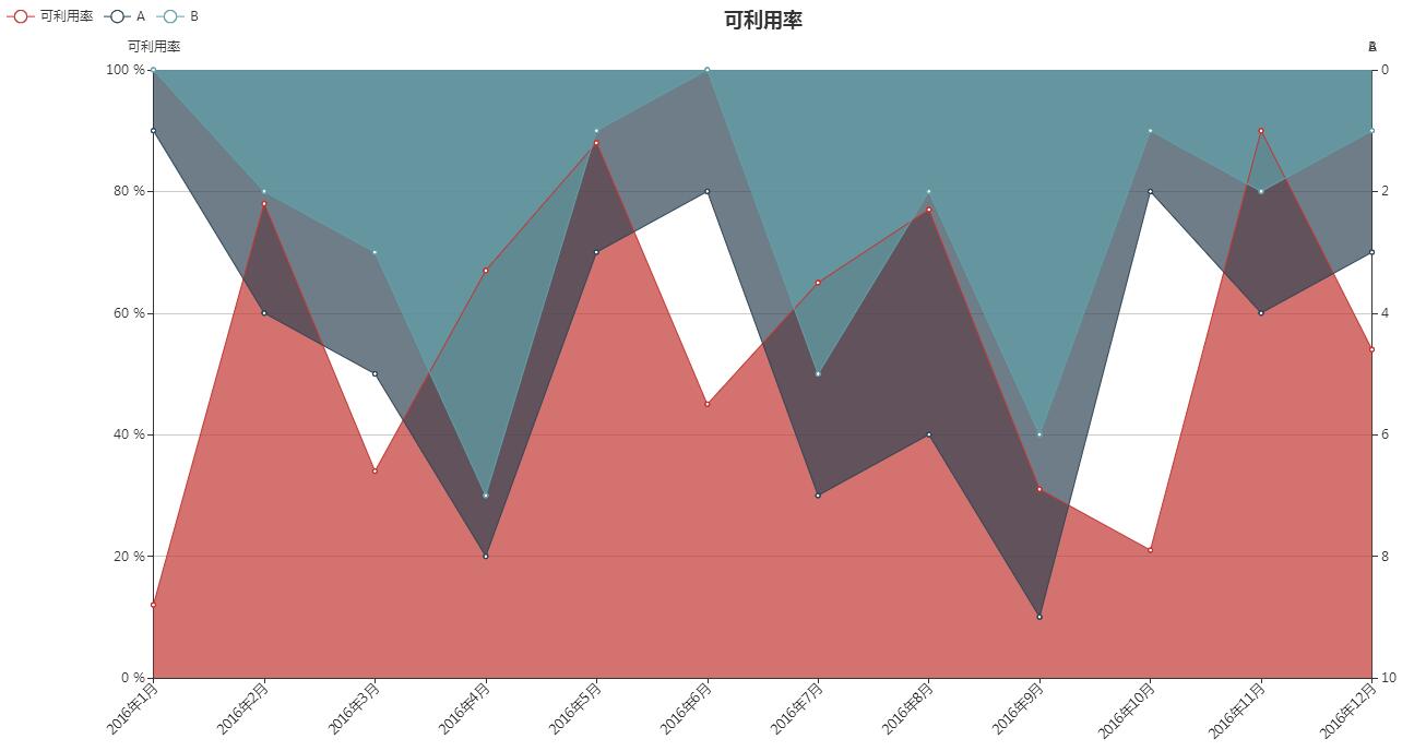
利用Echarts制作一个折线图,条件是:三条折线,一条代表可利用率,另外两条代表数量。
2、实现源码:
代码如下 | 复制代码 |
body,html{ width: 99%; height: 99%; font-family:"微软雅黑"; font-size: 12px; } #double{ width: 100%; height: 100%; font-family:"agency fb"; font-weight: bolder; }
$(function(){ varchart = document.getElementById('double'); varechart = echarts.init(chart); varoption = { title : { text:'可利用率', subtext:'', x:'center', align:'right' }, grid: { bottom: 80 }, tooltip : { trigger:'axis', axisPointer: { animation:false }, formatter:function(params) { varres = params[0].name; for(vari = 0, l = params.length; i < l; i++) { if(i==0) { res +=' } else { res +=' } } returnres; } }, legend: { data:['可利用率','A','B'], x:'left' }, xAxis : [ { type :'category', axisLabel: { rotate: 45 }, boundaryGap :false, axisLine: {onZero:false}, data : ['2016年1月','2016年2月','2016年3月','2016年4月','2016年5月','2016年6月','2016年7月','2016年8月','2016年9月','2016年10月','2016年11月','2016年12月'].map(function(str) { returnstr.replace(' ','\n') }) } ], yAxis: [ { name:'可利用率', type:'value', max: 100, axisLabel: { show:true, interval:'auto', formatter:'{value} %' } }, { name:'A', nameLocation:'start', type:'value', inverse:true }, { name:'B', nameLocation:'start', type:'value', inverse:true } ], series: [ { name:'可利用率', type:'line', hoverAnimation:false, itemStyle: { normal: { label : { show:false, position:'top', formatter:'{c} %' } } }, areaStyle: { normal: {} }, lineStyle: { normal: { width: 1 } }, data:[12,78,34,67,88,45,65,77,31,21,90,54] }, { name:'A', type:'line', yAxisIndex:1, hoverAnimation:false, areaStyle: { normal: {} }, lineStyle: { normal: { width: 1 } }, data: [1,4,5,8,3,2,7,6,9,2,4,3] }, { name:'B', type:'line', yAxisIndex:1, hoverAnimation:false, areaStyle: { normal: {} }, lineStyle: { normal: { width: 1 } }, data: [0,2,3,7,1,0,5,2,6,1,2,1] } ] }; echart.setOption(option); });
|
3、实现效果图: