


最新下载


热门教程
- 1
- 2
- 3
- 4
- 5
- 6
- 7
- 8
- 9
- 10
Bootstrap弹出框和提示框效果及源码
时间:2015-12-06 编辑:简简单单 来源:一聚教程网
一、Bootstrap弹出框
使用过JQuery UI的园友们应该知道,它里面有一个dialog的弹出框组件,功能也很丰富。与jQuery UI的dialog类似,Bootstrap里面也内置了弹出框组件。打开bootstrap 文档http://v3.bootcss.com/components/可以看到它的dialog是直接嵌入到bootstrap.js和bootstrap.css里面的,也就是说,只要我们引入了bootstrap的文件,就可以直接使用它的dialog组件,是不是很方便。本篇我们就结合新增编辑的功能来介绍下bootstrap dialog的使用。废话不多说,直接看来它如何使用吧。
1、cshtml界面代码
最外面的div定义了dialog的隐藏。我们重点来看看第二层的div
这个div定义了dialog,对应的class有三种尺寸的弹出框,如下:
第一种表示默认类型的弹出框;第二种表示增大的弹出框;第三种表示满屏的弹出框。role="document"表示弹出框的对象的当前的document。
2、js里面将dialog show出来。
默认情况下,我们的弹出框是隐藏的,只有在用户点击某个操作的时候才会show出来。来看看js里面是如何处理的吧:
//注册新增按钮的事件
$("#btn_add").click(function () {
$("#myModalLabel").text("新增");
$('#myModal').modal();
});
对,你没有看错,只需要这一句就能show出这个dialog.
$('#myModal').modal();
3、效果展示
新增效果

编辑效果

4、说明
弹出框显示后,点击界面上其他地方以及按Esc键都能隐藏弹出框,这样使得用户的操作更加友好。关于dialog里面关闭和保存按钮的事件的初始化在项目里面一般是封装过的,这个我们待会来看。
二、确认取消提示框
这种类型的提示框一般用于某些需要用户确定才能进行的操作,比较常见的如:删除操作、提交订单操作等。
1、使用bootstrap弹出框确认取消提示框
介绍这个组件之前,就得说说组件封装了,我们知道,像弹出框、确认取消提示框、信息提示框这些东西项目里面肯定是多处都要调用的,所以我们肯定是要封装组件的。下面就来看看我们封装的缺乏取消提示框。
(function ($) {
window.Ewin = function () {
var html = '
'
'' +
'
'
var dialogdHtml = '
'
'' +
'
'
var reg = new RegExp("\\[([^\\[\\]]*?)\\]", 'igm');
var generateId = function () {
var date = new Date();
return 'mdl' + date.valueOf();
}
var init = function (options) {
options = $.extend({}, {
title: "操作提示",
message: "提示内容",
btnok: "确定",
btncl: "取消",
width: 200,
auto: false
}, options || {});
var modalId = generateId();
var content = html.replace(reg, function (node, key) {
return {
Id: modalId,
Title: options.title,
Message: options.message,
BtnOk: options.btnok,
BtnCancel: options.btncl
}[key];
});
$('body').append(content);
$('#' + modalId).modal({
width: options.width,
backdrop: 'static'
});
$('#' + modalId).on('hide.bs.modal', function (e) {
$('body').find('#' + modalId).remove();
});
return modalId;
}
return {
alert: function (options) {
if (typeof options == 'string') {
options = {
message: options
};
}
var id = init(options);
var modal = $('#' + id);
modal.find('.ok').removeClass('btn-success').addClass('btn-primary');
modal.find('.cancel').hide();
return {
id: id,
on: function (callback) {
if (callback && callback instanceof Function) {
modal.find('.ok').click(function () { callback(true); });
}
},
hide: function (callback) {
if (callback && callback instanceof Function) {
modal.on('hide.bs.modal', function (e) {
callback(e);
});
}
}
};
},
confirm: function (options) {
var id = init(options);
var modal = $('#' + id);
modal.find('.ok').removeClass('btn-primary').addClass('btn-success');
modal.find('.cancel').show();
return {
id: id,
on: function (callback) {
if (callback && callback instanceof Function) {
modal.find('.ok').click(function () { callback(true); });
modal.find('.cancel').click(function () { callback(false); });
}
},
hide: function (callback) {
if (callback && callback instanceof Function) {
modal.on('hide.bs.modal', function (e) {
callback(e);
});
}
}
};
},
dialog: function (options) {
options = $.extend({}, {
title: 'title',
url: '',
width: 800,
height: 550,
onReady: function () { },
onShown: function (e) { }
}, options || {});
var modalId = generateId();
var content = dialogdHtml.replace(reg, function (node, key) {
return {
Id: modalId,
Title: options.title
}[key];
});
$('body').append(content);
var target = $('#' + modalId);
target.find('.modal-body').load(options.url);
if (options.onReady())
options.onReady.call(target);
target.modal();
target.on('shown.bs.modal', function (e) {
if (options.onReady(e))
options.onReady.call(target, e);
});
target.on('hide.bs.modal', function (e) {
$('body').find(target).remove();
});
}
}
}();
})(jQuery);
不了解组件封装的朋友可以先看看相关文章。这里我们的确认取消提示框主要用到了confirm这个属性对应的方法。还是来看看如何调用吧:
//注册删除按钮的事件
$("#btn_delete").click(function () {
//取表格的选中行数据
var arrselections = $("#tb_departments").bootstrapTable('getSelections');
if (arrselections.length <= 0) {
toastr.warning('请选择有效数据');
return;
}
Ewin.confirm({ message: "确认要删除选择的数据吗?" }).on(function (e) {
if (!e) {
return;
}
$.ajax({
type: "post",
url: "/api/DepartmentApi/Delete",
data: { "": JSON.stringify(arrselections) },
success: function (data, status) {
if (status == "success") {
toastr.success('提交数据成功');
$("#tb_departments").bootstrapTable('refresh');
}
},
error: function () {
toastr.error('Error');
},
complete: function () {
}
});
});
});
message属性传入提示的信息,on里面注入点击按钮后的回调事件。
生成的效果:

2、bootbox组件的使用
在网上找bootstrap的弹出组件时总是可以看到bootbox这么一个东西,确实是一个很简单的组件,还是来看看如何使用吧。
bootbox API:http://bootboxjs.com/documentation.html
当然要使用它必须要添加组件喽。无非也是两种方式:引入源码和Nuget。
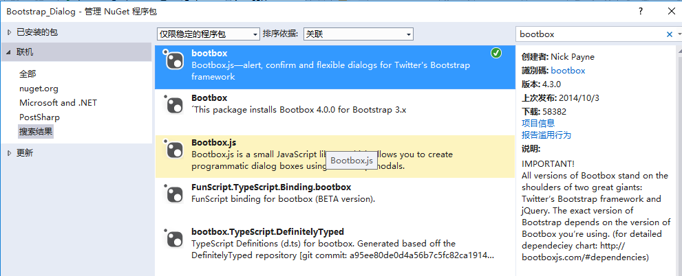
接下来就是使用它了。首先当然是添加bootbox.js的引用了。然后就是在相应的地方调用了。
$("#btn_delete").click(function () {
var arrselections = $("#tb_departments").bootstrapTable('getSelections');
if (arrselections.length <= 0) {
toastr.warning('请选择有效数据');
return;
}
bootbox.alert("确认删除", function () {
var strResult = "";
})
bootbox.prompt("确认删除", function (result) {
var strResult = result;
})
bootbox.confirm("确认删除", function (result) {
var strResult = result;
})
});
效果展示:
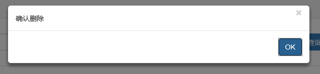


更多用法可以参见api。使用起来基本很简单。这个组件最大的特点就是和bootstrap的风格能够很好的保持一致。
3、在网上还找到一个效果比较炫一点的提示框:sweetalert

要使用它,还是老规矩:Nuget。
(1)文档
sweetalert Api:http://t4t5.github.io/sweetalert/
开源项目源码:https://github.com/t4t5/sweetalert
(2)在cshtml页面引入js和css
(3)js使用
swal({
title: "操作提示", //弹出框的title
text: "确定删除吗?", //弹出框里面的提示文本
type: "warning", //弹出框类型
showCancelButton: true, //是否显示取消按钮
confirmButtonColor: "#DD6B55",//确定按钮颜色
cancelButtonText: "取消",//取消按钮文本
confirmButtonText: "是的,确定删除!",//确定按钮上面的文档
closeOnConfirm: true
}, function () {
$.ajax({
type: "post",
url: "/Home/Delete",
data: { "": JSON.stringify(arrselections) },
success: function (data, status) {
if (status == "success") {
toastr.success('提交数据成功');
$("#tb_departments").bootstrapTable('refresh');
}
},
error: function () {
toastr.error('Error');
},
complete: function () {
}
});
});
(4)效果展示:

点击确定后进入回调函数:

组件很多,用哪种园友没可以自行决定,不过博主觉得像一些互联网、电子商务类型的网站用sweetalert效果比较合适,一般的内部系统可能也用不上。
三、操作完成提示框
1、toastr.js组件
关于信息提示框,博主项目中使用的是toastr.js这么一个组件,这个组件最大的好处就是异步、无阻塞,提示后可设置消失时间,并且可以将消息提示放到界面的各个地方。先来看看效果。


显示在不同位置:
top-center位置

bottom-left位置

官方文档以及源码
源码网站:http://codeseven.github.io/toastr/
api:http://www.ithao123.cn/content-2414918.html
关于它的使用。
(1)、引入js和css
(2)、js初始化
将这个属性值设置为不同的值就能让提示信息显示在不同的位置,如toast-bottom-right表示下右、toast-bottom-center表示下中、toast-top-center表示上中等,更过位置信息请查看文档。
(3)、使用
//初始化编辑按钮
$("#btn_edit").click(function () {
var arrselections = $("#tb_departments").bootstrapTable('getSelections');
if (arrselections.length > 1) {
toastr.warning('只能选择一行进行编辑');
return;
}
if (arrselections.length <= 0) {
toastr.warning('请选择有效数据');
return;
}
$('#myModal').modal();
});
使用起来就如下一句:
toastr.warning('只能选择一行进行编辑');
是不是很简单~~这里的有四种方法分别对应四种不同颜色的提示框。
toastr.success('提交数据成功');
toastr.error('Error');
toastr.warning('只能选择一行进行编辑');
toastr.info('info');
分别对应上图中的四种颜色的提示框。
2、Messenger组件
在Bootstrap中文网里面提到了一个alert组件:Messenger。

它的使用和toastr.js这个组件基本相似,只不过效果有点不太一样。我们还是来看看它是如何使用的。
(1)效果展示
可以定位到网页的不同位置,例如下图中给出的下中位置、上中位置。

提示框的样式有三种状态:Success、Error、Info


并且支持四种不同样式的提示框:Future、Block、Air、Ice


(2)组件使用以及代码示例
Messenger Api文档:http://www.bootcss.com/p/messenger/
Messenger 源码:https://github.com/HubSpot/messenger
关于它的使用和toastr大同小异,首先引入组件:
初始化它的位置
然后js里面使用如下:
$("#btn_delete").click(function () {
$.globalMessenger().post({
message: "操作成功",//提示信息
type: 'info',//消息类型。error、info、success
hideAfter: 2,//多长时间消失
showCloseButton:true,//是否显示关闭按钮
hideOnNavigate: true //是否隐藏导航
});
});
如果提示框使用默认样式,也只有一句就能解决
$.globalMessenger().post({
message: "操作成功",//提示信息
type: 'info',//消息类型。error、info、success
});
很简单很强大有木有~~
-
上一个: Javascript中的继承与原型链理解
-
下一个: JQuery实现―黑客帝国代码下落特效
相关文章
- Bootstrap的popover(弹出框)2秒后定时消失的实现代码 05-07
- Bootstrap的popover(弹出框)在append后弹不出(失效) 05-05
- BootStrap 弹出层代码 03-24
- HTML简单购物数量小程序代码展示 10-31
- html canvas实现弹幕功能 10-31
- HTML中空格表示的意义 10-31
热门栏目
-
php教程
php入门 php安全 php安装 php常用代码 php高级应用 -
asp.net教程
基础入门 .Net开发 C语言 VB.Net语言 WebService -
手机开发
安卓教程 ios7教程 Windows Phone Windows Mobile 手机常见问题 -
css教程
CSS入门 常用代码 经典案例 样式布局 高级应用 -
网页制作
设计基础 Dreamweaver Frontpage js教程 XNL/XSLT -
办公数码
word excel powerpoint 金山WPS 电脑新手 -
jsp教程
Application与Applet J2EE/EJB/服务器 J2ME开发 Java基础 Java技巧及代码