


最新下载


热门教程
- 1
- 2
- 3
- 4
- 5
- 6
- 7
- 8
- 9
- 10
js实现旋转木马效果
时间:2017-07-06 编辑:简简单单 来源:一聚教程网
效果图:
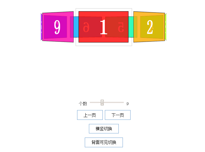
代码如下:
| 代码如下 | 复制代码 |
.container { width: 210px; height: 140px; position: relative; margin: 50px auto 40px; border: 1px solid #CCC; -webkit-perspective: 1100px; -moz-perspective: 1100px; -o-perspective: 1100px; perspective: 1100px; } #carousel { width: 100%; height: 100%; position: absolute; -webkit-transform-style: preserve-3d; -moz-transform-style: preserve-3d; -o-transform-style: preserve-3d; transform-style: preserve-3d; } .ready #carousel { -webkit-transition: -webkit-transform 1s; -moz-transition: -moz-transform 1s; -o-transition: -o-transform 1s; transition: transform 1s; } #carousel.panels-backface-invisible figure { -webkit-backface-visibility: hidden; -moz-backface-visibility: hidden; -o-backface-visibility: hidden; backface-visibility: hidden; } #carousel figure { display: block; position: absolute; width: 186px; height: 116px; left: 10px; top: 10px; border: 2px solid black; line-height: 116px; font-size: 80px; font-weight: bold; color: white; text-align: center; } .ready #carousel figure { -webkit-transition: opacity 1s, -webkit-transform 1s; -moz-transition: opacity 1s, -moz-transform 1s; -o-transition: opacity 1s, -o-transform 1s; transition: opacity 1s, transform 1s; } #options{ margin-top: 200px; width: 100%; text-align: center; } #options button{padding: 0.5em 1.5em;border: 2px solid #6699cc;background: #fff;}
| |