


最新下载


热门教程
- 1
- 2
- 3
- 4
- 5
- 6
- 7
- 8
- 9
- 10
transform实现一个纯CSS弹出菜单的示例代码
时间:2020-07-28 编辑:袖梨 来源:一聚教程网
本篇文章小编给大家分享一下transform实现一个纯CSS弹出菜单的示例代码,文章代码介绍的很详细,小编觉得挺不错的,现在分享给大家供大家参考,有需要的小伙伴们可以来看看。
前言
在制作顶部菜单的时候,都会要求制作弹出的二级菜单,早先的做法是用jQuery的来控制二级菜单的显示和过渡动画,但利用CSS3中的transform属性后,这一切都变得异常简单
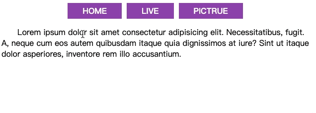
先上效果
制作方法
核心就是利用了transform的区域位移方法,在配合上li标签的hover伪类和动画延时,从而简单实现了子菜单的显示
css;"> *{
    padding: 0;
    margin: 0;
    box-sizing: border-box;
  }
  body{
    width: 100vw;
    height: 100vh;
    display: flex;
    flex-direction: column;
    justify-content: flex-start;
    align-items: center;
  }
  nav{
    margin: 10px;
  }
  nav ul {
    list-style-type: none;

    display: flex;
  }
  nav ul li{
    margin-right: 10px;
  }
  nav ul li strong{
    text-transform: uppercase;
    background-color: #9b59b6;
    color: white;
    padding: 5px 30px;
    line-
    cursor: pointer;
  }
  nav ul li strong+div{
    display: flex;
    flex-direction: column;
    background-color: #3498db;
    padding: 10px;
    transform: translateY(-110%);
    opacity: 0;
    transition: .3s;
    transform-origin: top;
  }
  nav ul li:hover div{
    transform: translateY(0);
    opacity: 1;
  }
  nav ul li strong+div a{
    color: white;
    text-decoration: none;
    text-transform: uppercase;
    padding: 5px 0;
  }
相关文章
- CSS 鼠标点击拖拽效果代码展示 10-31
- CSS使用SVG实现动态分布的圆环发散路径动画教程 10-31
- CSS组合选择器解析 10-26
- css带搜索导航栏的代码展示 10-26
- css复合选择器的具体使用方法介绍 10-26
- css三列自适应布局教程 10-26