


最新下载


热门教程
- 1
- 2
- 3
- 4
- 5
- 6
- 7
- 8
- 9
- 10
CSS3如何实现倒计时效果 CSS3实现倒计时效果代码示例
时间:2020-11-28 编辑:袖梨 来源:一聚教程网
CSS3如何实现倒计时效果?本篇文章小编给大家分享一下CSS3实现倒计时效果代码示例,文章代码介绍的很详细,小编觉得挺不错的,现在分享给大家供大家参考,有需要的小伙伴们可以来看看。
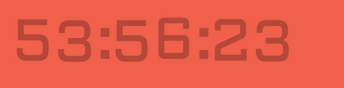
实现效果
实现代码
html
0 5 4 3 2 1 00 9 8 7 6 5 4 3 2 1 00 5 4 3 2 1 00 9 8 7 6 5 4 3 2 1 00 9 8 7 6 5 4 3 2 1 00 9 8 7 6 5 4 3 2 1 0
/* Play with speed and easing of the animation */
/* =========================================== */
.digit {
  display: inline-block;
  font-size: 200px;
  color: rgba(0, 0, 0, 0.25);

  line-height: 1;
}

.time-part-wrapper {
  display: inline-block;
  margin-right: 50px;
  position: relative;
}
.time-part-wrapper:not(:last-child):after {
  content: ":";
  display: block;


  position: absolute;
  top: 0px;
  right: -30px;
  color: rgba(0, 0, 0, 0.25);
  font-size: 200px;
  line-height: 0.9;
}

.time-part {

  text-align: center;

  overflow: hidden;
  display: inline-block;
  margin-left: -5px;
  box-sizing: border-box;
}
.time-part .digit-wrapper {
  animation-timing-function: cubic-bezier(1, 0, 1, 0);
}
.time-part.minutes.tens .digit-wrapper {
  animation-name: minutes-tens;
  animation-duration: 3600s;
  animation-iteration-count: 1;
}
.time-part.minutes.ones .digit-wrapper {
  animation-name: minutes-ones;
  animation-duration: 600s;
  animation-iteration-count: 6;
}
.time-part.seconds.tens .digit-wrapper {
  animation-name: seconds-tens;
  animation-duration: 60s;
  animation-iteration-count: 60;
}
.time-part.seconds.ones .digit-wrapper {
  animation-name: seconds-ones;
  animation-duration: 10s;
  animation-iteration-count: 360;
}
.time-part.hundredths.tens .digit-wrapper {
  animation-name: hundredths-tens;
  animation-duration: 1s;
  animation-iteration-count: 3600;
}
.time-part.hundredths.ones .digit-wrapper {
  animation-name: hundredths-ones;
  animation-duration: 0.1s;
  animation-iteration-count: 36000;
}

@keyframes minutes-tens {
  0% {
    transform: translateY(-180px);
  }
  16.66667% {
    transform: translateY(-360px);
  }
  33.33333% {
    transform: translateY(-540px);
  }
  50% {
    transform: translateY(-720px);
  }
  66.66667% {
    transform: translateY(-900px);
  }
  83.33333% {
    transform: translateY(-1080px);
  }
}
@keyframes minutes-ones {
  0% {
    transform: translateY(-180px);
  }
  10% {
    transform: translateY(-360px);
  }
  20% {
    transform: translateY(-540px);
  }
  30% {
    transform: translateY(-720px);
  }
  40% {
    transform: translateY(-900px);
  }
  50% {
    transform: translateY(-1080px);
  }
  60% {
    transform: translateY(-1260px);
  }
  70% {
    transform: translateY(-1440px);
  }
  80% {
    transform: translateY(-1620px);
  }
  90% {
    transform: translateY(-1800px);
  }
}
@keyframes seconds-tens {
  0% {
    transform: translateY(-180px);
  }
  16.66667% {
    transform: translateY(-360px);
  }
  33.33333% {
    transform: translateY(-540px);
  }
  50% {
    transform: translateY(-720px);
  }
  66.66667% {
    transform: translateY(-900px);
  }
  83.33333% {
    transform: translateY(-1080px);
  }
}
@keyframes seconds-ones {
  0% {
    transform: translateY(-180px);
  }
  10% {
    transform: translateY(-360px);
  }
  20% {
    transform: translateY(-540px);
  }
  30% {
    transform: translateY(-720px);
  }
  40% {
    transform: translateY(-900px);
  }
  50% {
    transform: translateY(-1080px);
  }
  60% {
    transform: translateY(-1260px);
  }
  70% {
    transform: translateY(-1440px);
  }
  80% {
    transform: translateY(-1620px);
  }
  90% {
    transform: translateY(-1800px);
  }
}
@keyframes hundredths-tens {
  0% {
    transform: translateY(-180px);
  }
  10% {
    transform: translateY(-360px);
  }
  20% {
    transform: translateY(-540px);
  }
  30% {
    transform: translateY(-720px);
  }
  40% {
    transform: translateY(-900px);
  }
  50% {
    transform: translateY(-1080px);
  }
  60% {
    transform: translateY(-1260px);
  }
  70% {
    transform: translateY(-1440px);
  }
  80% {
    transform: translateY(-1620px);
  }
  90% {
    transform: translateY(-1800px);
  }
}
@keyframes hundredths-ones {
  0% {
    transform: translateY(-180px);
  }
  10% {
    transform: translateY(-360px);
  }
  20% {
    transform: translateY(-540px);
  }
  30% {
    transform: translateY(-720px);
  }
  40% {
    transform: translateY(-900px);
  }
  50% {
    transform: translateY(-1080px);
  }
  60% {
    transform: translateY(-1260px);
  }
  70% {
    transform: translateY(-1440px);
  }
  80% {
    transform: translateY(-1620px);
  }
  90% {
    transform: translateY(-1800px);
  }
}
body {
  background: #F1614B;
  margin: 0;
  font-family: "Aldrich";
}

.wrapper {
  margin: 100px auto;

  position: relative;
}
.wrapper:before, .wrapper:after {
  content: "";
  display: block;
  position: absolute;
  width: 100%;
  left: 0;

  z-index: 10;
}
.wrapper:before {
  top: 0px;
  background-image: url('data:image/svg+xml;base64,PD94bWwgdmVyc2lvbj0iMS4wIiBlbmNvZGluZz0idXRmLTgiPz4gPHN2ZyB2ZXJzaW9uPSIxLjEiIHhtbG5zPSJodHRwOi8vd3d3LnczLm9yZy8yMDAwL3N2ZyI+PGRlZnM+PGxpbmVhckdyYWRpZW50IGlkPSJncmFkIiBncmFkaWVudFVuaXRzPSJvYmplY3RCb3VuZGluZ0JveCIgeDE9IjAuNSIgeTE9IjAuMCIgeDI9IjAuNSIgeTI9IjEuMCI+PHN0b3Agb2Zmc2V0PSIwJSIgc3RvcC1jb2xvcj0iI2YxNjE0YiIvPjxzdG9wIG9mZnNldD0iMTAwJSIgc3RvcC1jb2xvcj0iI2YxNjE0YiIgc3RvcC1vcGFjaXR5PSIwLjAiLz48L2xpbmVhckdyYWRpZW50PjwvZGVmcz48cmVjdCB4PSIwIiB5PSIwIiB3aWR0aD0iMTAwJSIgaGVpZ2h0PSIxMDAlIiBmaWxsPSJ1cmwoI2dyYWQpIiAvPjwvc3ZnPiA=');
  background-size: 100%;
  background-image: -webkit-gradient(linear, 50% 0%, 50% 100%, color-stop(0%, #f1614b), color-stop(100%, rgba(241, 97, 75, 0)));
  background-image: -moz-linear-gradient(top, #f1614b 0%, rgba(241, 97, 75, 0) 100%);
  background-image: -webkit-linear-gradient(top, #f1614b 0%, rgba(241, 97, 75, 0) 100%);
  background-image: linear-gradient(to bottom, #f1614b 0%, rgba(241, 97, 75, 0) 100%);
}
.wrapper:after {
  bottom: 0px;
  background-image: url('data:image/svg+xml;base64,PD94bWwgdmVyc2lvbj0iMS4wIiBlbmNvZGluZz0idXRmLTgiPz4gPHN2ZyB2ZXJzaW9uPSIxLjEiIHhtbG5zPSJodHRwOi8vd3d3LnczLm9yZy8yMDAwL3N2ZyI+PGRlZnM+PGxpbmVhckdyYWRpZW50IGlkPSJncmFkIiBncmFkaWVudFVuaXRzPSJvYmplY3RCb3VuZGluZ0JveCIgeDE9IjAuNSIgeTE9IjAuMCIgeDI9IjAuNSIgeTI9IjEuMCI+PHN0b3Agb2Zmc2V0PSIwJSIgc3RvcC1jb2xvcj0iI2YxNjE0YiIgc3RvcC1vcGFjaXR5PSIwLjAiLz48c3RvcCBvZmZzZXQ9IjEwMCUiIHN0b3AtY29sb3I9IiNmMTYxNGIiLz48L2xpbmVhckdyYWRpZW50PjwvZGVmcz48cmVjdCB4PSIwIiB5PSIwIiB3aWR0aD0iMTAwJSIgaGVpZ2h0PSIxMDAlIiBmaWxsPSJ1cmwoI2dyYWQpIiAvPjwvc3ZnPiA=');
  background-size: 100%;
  background-image: -webkit-gradient(linear, 50% 0%, 50% 100%, color-stop(0%, rgba(241, 97, 75, 0)), color-stop(100%, #f1614b));
  background-image: -moz-linear-gradient(top, rgba(241, 97, 75, 0) 0%, #f1614b 100%);
  background-image: -webkit-linear-gradient(top, rgba(241, 97, 75, 0) 0%, #f1614b 100%);
  background-image: linear-gradient(to bottom, rgba(241, 97, 75, 0) 0%, #f1614b 100%);
}
相关文章
- css3中仿放大镜效果的几种方式原理介绍 10-26
- CSS3切割轮播图的代码展示 10-26
- css3制作背景渐变动画效果教程 10-26
- CSS3呈现的定价表 09-16
- CSS3如何制作彩虹按钮样式 09-16
- CSS3图片悬停的切换按钮介绍 09-16