


最新下载


热门教程
- 1
- 2
- 3
- 4
- 5
- 6
- 7
- 8
- 9
- 10
纯CSS3如何实现运行时钟 纯CSS3实现运行时钟示例代码
时间:2021-01-28 编辑:袖梨 来源:一聚教程网
纯CSS3如何实现运行时钟?本篇文章小编给大家分享一下纯CSS3实现运行时钟示例代码,文章代码介绍的很详细,小编觉得挺不错的,现在分享给大家供大家参考,有需要的小伙伴们可以来看看。
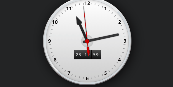
运行效果
代码实现
html
- 23
- 00
- 01
- 02
- 03
- 04
- 05
- 06
- 07
- 08
- 09
- 10
- 11
- 12
- 13
- 14
- 15
- 16
- 17
- 18
- 19
- 20
- 21
- 22
- 10
- 11
- 12
- 13
- 14
- 15
- 16
- 17
- 18
- 19
- 20
- 21
- 22
- 23
- 24
- 25
- 26
- 27
- 28
- 29
- 30
- 31
- 32
- 33
- 34
- 35
- 36
- 37
- 38
- 39
- 40
- 41
- 42
- 43
- 44
- 45
- 46
- 47
- 48
- 49
- 50
- 51
- 52
- 53
- 54
- 55
- 56
- 57
- 58
- 59
- 00
- 01
- 02
- 03
- 04
- 05
- 06
- 07
- 08
- 09
- 20
- 21
- 22
- 23
- 24
- 25
- 26
- 27
- 28
- 29
- 30
- 31
- 32
- 33
- 34
- 35
- 36
- 37
- 38
- 39
- 40
- 41
- 42
- 43
- 44
- 45
- 46
- 47
- 48
- 49
- 50
- 51
- 52
- 53
- 54
- 55
- 56
- 57
- 58
- 59
- 00
- 01
- 02
- 03
- 04
- 05
- 06
- 07
- 08
- 09
- 10
- 11
- 12
- 13
- 14
- 15
- 16
- 17
- 18
- 19
- 1
- 2
- 3
- 4
- 5
- 6
- 7
- 8
- 9
- 10
- 11
- 12
CSS3
css;">body { font-size:62.5%; margin:1em; background:#232425 }
ul { list-style:none; margin:0; padding:0 }
#watch { font-size:1em; position:relative }
#watch .frame-face {
  position:relative;
  width:30em;
  height:30em;
  margin:2em auto;
  border-radius:15em;
  background:-webkit-linear-gradient(top, #f9f9f9,#666);
  background:-moz-linear-gradient(top, #f9f9f9,#666);
  background:linear-gradient(to bottom, #f9f9f9,#666);
  box-shadow:rgba(0,0,0,.8) .5em .5em 4em;
}
#watch .frame-face:before {
  content:'';
  width:29.4em;
  height:29.4em;
  border-radius:14.7em;
  position:absolute;
  top:.3em; left:.3em;
  background:
    -webkit-linear-gradient(135deg, rgba(246,248,249,0) 0%,rgba(229,235,238,1) 50%,rgba(205,212,217,1) 51%,rgba(245,247,249,0) 100%),
    -webkit-radial-gradient(center, ellipse cover, rgba(246,248,249,1) 0%,rgba(229,235,238,1) 65%,rgba(205,212,217,1) 66%,rgba(245,247,249,1) 100%);
  background:
    -moz-linear-gradient(135deg, rgba(246,248,249,0) 0%,rgba(229,235,238,1) 50%,rgba(205,212,217,1) 51%,rgba(245,247,249,0) 100%),
    -moz-radial-gradient(center, ellipse cover, rgba(246,248,249,1) 0%,rgba(229,235,238,1) 65%,rgba(205,212,217,1) 66%,rgba(245,247,249,1) 100%);
  background:
    linear-gradient(135deg, rgba(246,248,249,0) 0%,rgba(229,235,238,1) 50%,rgba(205,212,217,1) 51%,rgba(245,247,249,0) 100%),
    radial-gradient(ellipse at center, rgba(246,248,249,1) 0%,rgba(229,235,238,1) 65%,rgba(205,212,217,1) 66%,rgba(245,247,249,1) 100%);
}
#watch .frame-face:after {
  content:'';
  width:28em;
  height:28em;
  border-radius:14.2em;
  position:absolute;
  top:.9em; left:.9em;
  box-shadow:inset rgba(0,0,0,.2) .2em .2em 1em;
  border:.1em solid rgba(0,0,0,.2);
  background:-webkit-linear-gradient(top, #fff, #ccc);
  background:-moz-linear-gradient(top, #fff, #ccc);
  background:linear-gradient(to bottom, #fff, #ccc);
}
#watch .minute-marks li {
  display:block;
  width:.2em;
  height:.6em;
  background:#929394;
  position:absolute;
  top:50%; left:50%;
  margin:-.4em 0 0 -.1em;
}
#watch .minute-marks li:first-child {transform:rotate(6deg) translateY(-12.7em)}
#watch .minute-marks li:nth-child(2) {transform:rotate(12deg) translateY(-12.7em)}
#watch .minute-marks li:nth-child(3) {transform:rotate(18deg) translateY(-12.7em)}
#watch .minute-marks li:nth-child(4) {transform:rotate(24deg) translateY(-12.7em)}
#watch .minute-marks li:nth-child(5) {transform:rotate(36deg) translateY(-12.7em)}
#watch .minute-marks li:nth-child(6) {transform:rotate(42deg) translateY(-12.7em)}
#watch .minute-marks li:nth-child(7) {transform:rotate(48deg) translateY(-12.7em)}
#watch .minute-marks li:nth-child(8) {transform:rotate(54deg) translateY(-12.7em)}
#watch .minute-marks li:nth-child(9) {transform:rotate(66deg) translateY(-12.7em)}
#watch .minute-marks li:nth-child(10) {transform:rotate(72deg) translateY(-12.7em)}
#watch .minute-marks li:nth-child(11) {transform:rotate(78deg) translateY(-12.7em)}
#watch .minute-marks li:nth-child(12) {transform:rotate(84deg) translateY(-12.7em)}
#watch .minute-marks li:nth-child(13) {transform:rotate(96deg) translateY(-12.7em)}
#watch .minute-marks li:nth-child(14) {transform:rotate(102deg) translateY(-12.7em)}
#watch .minute-marks li:nth-child(15) {transform:rotate(108deg) translateY(-12.7em)}
#watch .minute-marks li:nth-child(16) {transform:rotate(114deg) translateY(-12.7em)}
#watch .minute-marks li:nth-child(17) {transform:rotate(126deg) translateY(-12.7em)}
#watch .minute-marks li:nth-child(18) {transform:rotate(132deg) translateY(-12.7em)}
#watch .minute-marks li:nth-child(19) {transform:rotate(138deg) translateY(-12.7em)}
#watch .minute-marks li:nth-child(20) {transform:rotate(144deg) translateY(-12.7em)}
#watch .minute-marks li:nth-child(21) {transform:rotate(156deg) translateY(-12.7em)}
#watch .minute-marks li:nth-child(22) {transform:rotate(162deg) translateY(-12.7em)}
#watch .minute-marks li:nth-child(23) {transform:rotate(168deg) translateY(-12.7em)}
#watch .minute-marks li:nth-child(24) {transform:rotate(174deg) translateY(-12.7em)}
#watch .minute-marks li:nth-child(25) {transform:rotate(186deg) translateY(-12.7em)}
#watch .minute-marks li:nth-child(26) {transform:rotate(192deg) translateY(-12.7em)}
#watch .minute-marks li:nth-child(27) {transform:rotate(198deg) translateY(-12.7em)}
#watch .minute-marks li:nth-child(28) {transform:rotate(204deg) translateY(-12.7em)}
#watch .minute-marks li:nth-child(29) {transform:rotate(216deg) translateY(-12.7em)}
#watch .minute-marks li:nth-child(30) {transform:rotate(222deg) translateY(-12.7em)}
#watch .minute-marks li:nth-child(31) {transform:rotate(228deg) translateY(-12.7em)}
#watch .minute-marks li:nth-child(32) {transform:rotate(234deg) translateY(-12.7em)}
#watch .minute-marks li:nth-child(33) {transform:rotate(246deg) translateY(-12.7em)}
#watch .minute-marks li:nth-child(34) {transform:rotate(252deg) translateY(-12.7em)}
#watch .minute-marks li:nth-child(35) {transform:rotate(258deg) translateY(-12.7em)}
#watch .minute-marks li:nth-child(36) {transform:rotate(264deg) translateY(-12.7em)}
#watch .minute-marks li:nth-child(37) {transform:rotate(276deg) translateY(-12.7em)}
#watch .minute-marks li:nth-child(38) {transform:rotate(282deg) translateY(-12.7em)}
#watch .minute-marks li:nth-child(39) {transform:rotate(288deg) translateY(-12.7em)}
#watch .minute-marks li:nth-child(40) {transform:rotate(294deg) translateY(-12.7em)}
#watch .minute-marks li:nth-child(41) {transform:rotate(306deg) translateY(-12.7em)}
#watch .minute-marks li:nth-child(42) {transform:rotate(312deg) translateY(-12.7em)}
#watch .minute-marks li:nth-child(43) {transform:rotate(318deg) translateY(-12.7em)}
#watch .minute-marks li:nth-child(44) {transform:rotate(324deg) translateY(-12.7em)}
#watch .minute-marks li:nth-child(45) {transform:rotate(336deg) translateY(-12.7em)}
#watch .minute-marks li:nth-child(46) {transform:rotate(342deg) translateY(-12.7em)}
#watch .minute-marks li:nth-child(47) {transform:rotate(348deg) translateY(-12.7em)}
#watch .minute-marks li:nth-child(48) {transform:rotate(354deg) translateY(-12.7em)}
#watch .digits {
  width:30em;
  height:30em;
  border-radius:15em;
  position:absolute;
  top:0; left:50%;
  margin-left:-15em;
}
#watch .digits li {
  font-size:1.6em;
  display:block;
  width:1.6em;
  height:1.6em;
  position:absolute;
  top:50%; left:50%;
  line-height:1.6em;
  text-align:center;
  margin:-.8em 0 0 -.8em;
  font-weight:bold;
}
#watch .digits li:nth-child(1) { transform:translate(3.9em, -6.9em) }
#watch .digits li:nth-child(2) { transform:translate(6.9em, -4em) }
#watch .digits li:nth-child(3) { transform:translate(8em, 0) }
#watch .digits li:nth-child(4) { transform:translate(6.8em, 4em) }
#watch .digits li:nth-child(5) { transform:translate(3.9em, 6.9em) }
#watch .digits li:nth-child(6) { transform:translate(0, 8em) }
#watch .digits li:nth-child(7) { transform:translate(-3.9em, 6.9em) }
#watch .digits li:nth-child(8) { transform:translate(-6.8em, 4em) }
#watch .digits li:nth-child(9) { transform:translate(-8em, 0) }
#watch .digits li:nth-child(10) { transform:translate(-6.9em, -4em) }
#watch .digits li:nth-child(11) { transform:translate(-3.9em, -6.9em) }
#watch .digits li:nth-child(12) { transform:translate(0, -8em) }
#watch .digits:before {
  content:'';
  width:1.6em;
  height:1.6em;
  border-radius:.8em;
  position:absolute;
  top:50%; left:50%;
  margin:-.8em 0 0 -.8em;
  background:#121314;
}
#watch .digits:after {
  content:'';
  width:4em;
  height:4em;
  border-radius:2.2em;
  position:absolute;
  top:50%; left:50%;
  margin:-2.1em 0 0 -2.1em;
  border:.1em solid #c6c6c6;
  background:-webkit-radial-gradient(center, ellipse cover, rgba(200,200,200,0), rgba(190,190,190,1) 90%, rgba(130,130,130,1) 100%);
  background:-moz-radial-gradient(center, ellipse cover, rgba(200,200,200,0), rgba(190,190,190,1) 90%, rgba(130,130,130,1) 100%);
  background:radial-gradient(ellipse at center, rgba(200,200,200,0), rgba(190,190,190,1) 90%, rgba(130,130,130,1) 100%);
}
@keyframes hours { to {transform:rotate(335deg)} }
#watch .hours-hand {
  width:.8em;
  height:7em;
  border-radius:0 0 .9em .9em;
  background:#232425;
  position:absolute;
  bottom:50%; left:50%;
  margin:0 0 -.8em -.4em;
  box-shadow:#232425 0 0 2px;
  transform-origin:0.4em 6.2em;
  transform:rotate(-25deg);
  animation:hours 43200s linear 0s infinite;
}
#watch .hours-hand:before {
  content:'';
  background:inherit;
  width:1.8em;
  height:.8em;
  border-radius:0 0 .8em .8em;
  box-shadow:#232425 0 0 1px;
  position:absolute;
  top:-.7em; left:-.5em;
}
#watch .hours-hand:after {
  content:'';
  width:0; height:0;
  border:.9em solid #232425;
  border-width:0 .9em 2.4em .9em;
  border-left-color:transparent;
  border-right-color:transparent;
  position:absolute;
  top:-3.1em; left:-.5em;
}
@keyframes minutes { to {transform:rotate(422deg)} }
#watch .minutes-hand {
  width:.8em;
  height:12.5em;
  border-radius:.5em;
  background:#343536;
  position:absolute;
  bottom:50%; left:50%;
  margin:0 0 -1.5em -.4em;
  box-shadow:#343536 0 0 2px;
  transform-origin:0.4em 11em;
  transform:rotate(62deg);
  animation:minutes 3600s linear 0s infinite;
}
@keyframes seconds { to {transform:rotate(480deg)} }
#watch .seconds-hand {
  width:.2em;
  height:14em;
  border-radius:.1em .1em 0 0/10em 10em 0 0;
  background:#c00;
  position:absolute;
  bottom:50%; left:50%;
  margin:0 0 -2em -.1em;
  box-shadow:rgba(0,0,0,.8) 0 0 .2em;
  transform-origin:0.1em 12em;
  transform:rotate(120deg);
  animation:seconds 60s steps(60, end) 0s infinite;
}
#watch .seconds-hand:after {
  content:'';
  width:1.4em;
  height:1.4em;
  border-radius:.7em;
  background:inherit;
  position:absolute;
  left:-.65em; bottom:1.35em;
}
#watch .seconds-hand:before {
  content:'';
  width:.8em;
  height:3em;
  border-radius:.2em .2em .4em .4em/.2em .2em 2em 2em;
  box-shadow:rgba(0,0,0,.8) 0 0 .2em;
  background:inherit;
  position:absolute;
  left:-.35em; bottom:-3em;
}
#watch .digital-wrap {
  width:9em;
  height:3em;
  border:.1em solid #222;
  border-radius:.2em;
  position:absolute;
  top:50%; left:50%;
  margin:3em 0 0 -4.5em;
  overflow:hidden;
  background:#4c4c4c;
  background:-webkit-linear-gradient(top, #4c4c4c 0%,#0f0f0f 100%);
  background:-moz-linear-gradient(top, #4c4c4c 0%, #0f0f0f 100%);
  background:-ms-linear-gradient(top, #4c4c4c 0%,#0f0f0f 100%);
  background:-o-linear-gradient(top, #4c4c4c 0%,#0f0f0f 100%);
  background:linear-gradient(to bottom, #4c4c4c 0%,#0f0f0f 100%);
}
#watch .digital-wrap ul {
  float:left;
  width:2.85em;
  height:3em;
  border-right:.1em solid #000;
  color:#ddd;
  font-family:Consolas, monaco, monospace;
}
#watch .digital-wrap ul:last-child { border:none }
#watch .digital-wrap li {
  font-size:1.5em;
  line-height:2;
  letter-spacing:2px;
  text-align:center;
  position:relative;
  left:1px;
}
#watch .digit-minutes li {
  animation:dsm 3600s steps(60, end) 0s infinite;
}
#watch .digit-seconds li {
  animation:dsm 60s steps(60, end) 0s infinite;
}
@keyframes dsm {
  to { transform:translateY(-120em) }
}
-
下一个: 将Canvas绘制过程转为视频代码示例
相关文章
- css3中仿放大镜效果的几种方式原理介绍 10-26
- CSS3切割轮播图的代码展示 10-26
- css3制作背景渐变动画效果教程 10-26
- CSS3呈现的定价表 09-16
- CSS3如何制作彩虹按钮样式 09-16
- CSS3图片悬停的切换按钮介绍 09-16