一聚教程网:一个值得你收藏的教程网站
PHP教程 Css教程 操作系统 数据库
安全守护
司机宝
乐淘一番
饭团外卖
替替车主
外勤筋斗云
睿兽分析
边粉
智农谷
恋酒网
字母圈是什么梗 字母圈什么意思
《寻找夏日的宝物》全事件流程如何过
苹果版的avnight卡播放面问题解决
《绯月仙行录》元婴期怎么突破
《觅长生》丹方汇总
《周五夜放克》网页版地址一览
《绯月仙行录》魔界怎么到达
抖音成人版叫什么名字 抖音成人版介绍
口袋妖怪传说绿宝石熊徒弟怎么进化
《不双修就去世》全成就简易攻略
时间:2016-01-26 编辑:简简单单 来源:一聚教程网
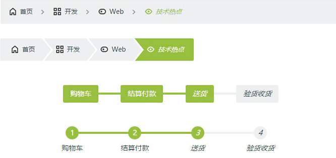
面包屑是用来做当前页面所在的站点位置的导航作用,它一层层的表示站点分类或目录层级关系,而多步骤指示经常用在一些分步流程向导的应用,如分步注册向导,货物订购流程。今天我们来用CSS制作面包屑和多步骤指示的应用。
HTML结构非常简单,一个有序列表ol,外面又包裹。 面包屑导航条的结构,我们给ol加上class样式为:.cd-breadcrumb,那么当前位置的层级li加上class样式为:.current。 首页 开发 Web 技术热点 多步骤指示的结构,我们给ol加上class样式为:.cd-multi-steps,已完成的步骤的li加上class样式:.visited,当前步骤li加上class样式:.current。 购物车 结算付款 送货 验货收货 CSS 首先,我们使用::after伪元素来创建分隔符元素,就是层级之间的分割。 .cd-breadcrumb li::after, .cd-multi-steps li::after { display: inline-block; content: '\00bb'; margin: 0 .6em; color: #959fa5; } 如果我们需要使用自定义的分隔符,可以自定义样式 .custom-separator,并将样式添加到元素上,例如: 首页 开发 Web 技术热点 完了分隔符的样式.custom-separator这样写: .cd-breadcrumb.custom-separator li::after, .cd-multi-steps.custom-separator li::after { /* replace the default separator with a custom icon */ content: ''; background: url(../img/cd-custom-separator.svg) no-repeat center center; vertical-align: middle; } 如果你像给面包屑导航和分步骤指示加上小图标,可以这些写样式,本例中我们使用svg文件来作图标处理。 .cd-breadcrumb.custom-icons li > *::before, .cd-multi-steps.custom-icons li > *::before { /* add a custom icon before each item */ content: ''; display: inline-block; margin-right: .4em; margin-top: -2px; background: url(../img/cd-custom-icons-01.svg) no-repeat 0 0; vertical-align: middle; } .cd-breadcrumb.custom-icons li:not(.current):nth-of-type(2) > *::before, .cd-multi-steps.custom-icons li:not(.current):nth-of-type(2) > *::before { /* change custom icon using image sprites */ background-position: -20px 0; } .cd-breadcrumb.custom-icons li:not(.current):nth-of-type(3) > *::before, .cd-multi-steps.custom-icons li:not(.current):nth-of-type(3) > *::before { background-position: -40px 0; } .cd-breadcrumb.custom-icons li:not(.current):nth-of-type(4) > *::before, .cd-multi-steps.custom-icons li:not(.current):nth-of-type(4) > *::before { background-position: -60px 0; } .cd-breadcrumb.custom-icons li.current:first-of-type > *::before, .cd-multi-steps.custom-icons li.current:first-of-type > *::before { /* change custom icon for the current item */ background-position: 0 -20px; } .cd-breadcrumb.custom-icons li.current:nth-of-type(2) > *::before, .cd-multi-steps.custom-icons li.current:nth-of-type(2) > *::before { background-position: -20px -20px; } .cd-breadcrumb.custom-icons li.current:nth-of-type(3) > *::before, .cd-multi-steps.custom-icons li.current:nth-of-type(3) > *::before { background-position: -40px -20px; } .cd-breadcrumb.custom-icons li.current:nth-of-type(4) > *::before, .cd-multi-steps.custom-icons li.current:nth-of-type(4) > *::before { background-position: -60px -20px; } 当然,我们也可以将三角形箭头设置成分隔符,代码如下: .cd-breadcrumb.triangle li::after, .cd-breadcrumb.triangle li > *::after { /* li > *::after is the colored triangle after each item li::after is the white separator between two items */ content: ''; position: absolute; top: 0; left: 100%; content: ''; height: 0; width: 0; /* 48px is the height of the element */ border: 24px solid transparent; border-right-width: 0; border-left- } .cd-breadcrumb.triangle li::after { /* this is the white separator between two items */ z-index: 1; -webkit-transform: translateX(4px); -moz-transform: translateX(4px); -ms-transform: translateX(4px); -o-transform: translateX(4px); transform: translateX(4px); border-left-color: #ffffff; /* reset style */ margin: 0; } .cd-breadcrumb.triangle li > *::after { /* this is the colored triangle after each element */ z-index: 2; border-left-color: inherit; } .cd-breadcrumb.triangle li:last-of-type::after, .cd-breadcrumb.triangle li:last-of-type > *::after { /* hide the triangle after the last step */ display: none; } 对于分步骤指示我们还可以添加class如:.text-center, .text-top和 .text-bottom来让文字的位置对齐,还可以添加class如count用来标记步骤数,如以下代码: 购物车 结算付款 送货 验货收货 各种添加的样式具体可以看演示demo,我们的demo中给出9种不同的示例,查看页面源代码你就会有收获
上一个: CSS3单页面垂直固定导航的例子
下一个: css inline-block的几个神奇的用法