


最新下载


热门教程
- 1
- 2
- 3
- 4
- 5
- 6
- 7
- 8
- 9
- 10
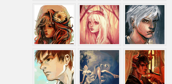
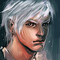
CSS3如何实现缩略图悬停效果 CSS3实现缩略图悬停效果代码示例
时间:2020-12-15 编辑:袖梨 来源:一聚教程网
CSS3如何实现缩略图悬停效果?本篇文章小编给大家分享一下CSS3实现缩略图悬停效果代码示例,文章代码介绍的很详细,小编觉得挺不错的,现在分享给大家供大家参考,有需要的小伙伴们可以来看看。
实现效果
实现代码
html
		Thumbnail Hover Effect with CSS3


		Images featured in this demo are the works of Mernan Behairi. Inspired by an old post of @Sohtanaka. It originally uses jQuery. Access original tutorial and demo.


css3
@import url(https://fonts.googleapis.com/css?family=Roboto+Condensed:700);

html, body, div, span, applet, object, iframe,
h1, h2, h3, h4, h5, h6, p, blockquote, pre,
a, abbr, acronym, address, big, cite, code,
del, dfn, em, img, ins, kbd, q, s, samp,
small, strike, strong, sub, sup, tt, var,
b, u, i, center,
dl, dt, dd, ol, ul, li,
fieldset, form, label, legend,
table, caption, tbody, tfoot, thead, tr, th, td,
article, aside, canvas, details, embed,
figure, figcaption, footer, header, hgroup,
menu, nav, output, ruby, section, summary,
time, mark, audio, video {
	margin: 0;
	padding: 0;
	border: 0;
	font-size: 100%;
	font: inherit;
	vertical-align: baseline;
}

body {
	background-color: #f2f2f2;
}

header {
	width: 100%;
	background-color: #77cdb4;
	text-align: center;
}

h1 {
	font-family: 'Roboto Condensed', sans-serif;
	color: #FFF;
	font-size: 2.3em;
}

em {
	color: #232027;
}

.wrapper {
	width: 40%;
	margin: 40px auto;
}

div.gallery {
	margin-top: 30px;
}

div.gallery ul {
	list-style-type: none;
	margin-left: 35px;
}

/* animation */
div.gallery ul li, div.gallery li img {
	-webkit-transition: all 0.1s ease-in-out;
  	-moz-transition: all 0.1s ease-in-out;
  	-o-transition: all 0.1s ease-in-out;
  	transition: all 0.1s ease-in-out;
}

div.gallery ul li {
	position: relative;
	float: left;


	margin: 5px;
	padding: 5px;
	z-index: 0;
}

/* Make sure z-index is higher on hover */
/* Ensure that hover image overlapped the others */
div.gallery ul li:hover {
	z-index: 5;
}

/* Image is position nicely under li */
div.gallery ul li img {
	position: absolute;
	left: 0;
	top: 0;
	border: 1px solid #dddddd;
	padding: 5px;


	background: #f0f0f0;
}

div.gallery ul li img:hover {


	margin-top: -130px;
	margin-left: -130px;
	top: 65%;
	left: 65%;
}

p.attribution {
	font-family: 'Consolas';
	color: #000;
	clear: both;
	text-align: center;
	line-
	padding-top: 30px;
}

p.attribution a {
	color: #4c8d7c;
}

/* Responsive hack */
@media only screen and (min-) and (max-) {
	.wrapper {

	}
}

@media only screen and (max-) {
	.wrapper {

	}

	div.gallery ul {
		list-style-type: none;
		margin: 0;
	}
}
相关文章
- css3中仿放大镜效果的几种方式原理介绍 10-26
- CSS3切割轮播图的代码展示 10-26
- css3制作背景渐变动画效果教程 10-26
- CSS3呈现的定价表 09-16
- CSS3如何制作彩虹按钮样式 09-16
- CSS3图片悬停的切换按钮介绍 09-16