


最新下载


热门教程
- 1
- 2
- 3
- 4
- 5
- 6
- 7
- 8
- 9
- 10
html+css3如何实现登录界面 html+css3实现登录界面代码示例
时间:2020-12-16 编辑:袖梨 来源:一聚教程网
html+css3如何实现登录界面?本篇文章小编给大家分享一下html+css3实现登录界面代码示例,文章代码介绍的很详细,小编觉得挺不错的,现在分享给大家供大家参考,有需要的小伙伴们可以来看看。
实现效果
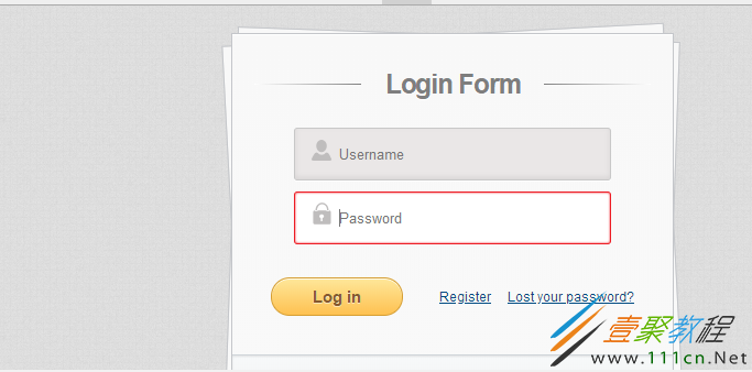
先用html搭建个基本框架
接着用CSS3美化一下
body {
	background: #DCDDDF url(https://cssdeck.com/uploads/media/items/7/7AF2Qzt.png);
	color: #000;
	font: 14px Arial;
	margin: 0 auto;
	padding: 0;
	position: relative;
}
h1{ font-size:28px;}
h2{ font-size:26px;}
h3{ font-size:18px;}
h4{ font-size:16px;}
h5{ font-size:14px;}
h6{ font-size:12px;}
h1,h2,h3,h4,h5,h6{ color:#563D64;}
small{ font-size:10px;}
b, strong{ font-weight:bold;}
a{ text-decoration: none; }
a:hover{ text-decoration: underline; }
.left { float:left; }
.right { float:right; }
.alignleft { float: left; margin-right: 15px; }
.alignright { float: right; margin-left: 15px; }
.clearfix:after,
form:after {
	content: ".";
	display: block;
	height: 0;
	clear: both;
	visibility: hidden;
}
.container { margin: 25px auto; position: relative;  }
#content {
	background: #f9f9f9;
	background: -moz-linear-gradient(top,  rgba(248,248,248,1) 0%, rgba(249,249,249,1) 100%);
	background: -webkit-linear-gradient(top,  rgba(248,248,248,1) 0%,rgba(249,249,249,1) 100%);
	background: -o-linear-gradient(top,  rgba(248,248,248,1) 0%,rgba(249,249,249,1) 100%);
	background: -ms-linear-gradient(top,  rgba(248,248,248,1) 0%,rgba(249,249,249,1) 100%);
	background: linear-gradient(top,  rgba(248,248,248,1) 0%,rgba(249,249,249,1) 100%);
	filter: progid:DXImageTransform.Microsoft.gradient( startColorstr='#f8f8f8', endColorstr='#f9f9f9',GradientType=0 );
	-webkit-box-shadow: 0 1px 0 #fff inset;
	-moz-box-shadow: 0 1px 0 #fff inset;
	-ms-box-shadow: 0 1px 0 #fff inset;
	-o-box-shadow: 0 1px 0 #fff inset;
	box-shadow: 0 1px 0 #fff inset;
	border: 1px solid #c4c6ca;
	margin: 0 auto;
	padding: 25px 0 0;
	position: relative;
	text-align: center;
	text-shadow: 0 1px 0 #fff;

}
#content h1 {
	color: #7E7E7E;
	font: bold 25px Helvetica, Arial, sans-serif;
	letter-spacing: -0.05em;
	line-
	margin: 10px 0 30px;
}
#content h1:before,
#content h1:after {
	content: "";

	position: absolute;
	top: 10px;
	width: 27%;
}
#content h1:after {
	background: rgb(126,126,126);
	background: -moz-linear-gradient(left,  rgba(126,126,126,1) 0%, rgba(255,255,255,1) 100%);
	background: -webkit-linear-gradient(left,  rgba(126,126,126,1) 0%,rgba(255,255,255,1) 100%);
	background: -o-linear-gradient(left,  rgba(126,126,126,1) 0%,rgba(255,255,255,1) 100%);
	background: -ms-linear-gradient(left,  rgba(126,126,126,1) 0%,rgba(255,255,255,1) 100%);
	background: linear-gradient(left,  rgba(126,126,126,1) 0%,rgba(255,255,255,1) 100%);
    right: 0;
}
#content h1:before {
	background: rgb(126,126,126);
	background: -moz-linear-gradient(right,  rgba(126,126,126,1) 0%, rgba(255,255,255,1) 100%);
	background: -webkit-linear-gradient(right,  rgba(126,126,126,1) 0%,rgba(255,255,255,1) 100%);
	background: -o-linear-gradient(right,  rgba(126,126,126,1) 0%,rgba(255,255,255,1) 100%);
	background: -ms-linear-gradient(right,  rgba(126,126,126,1) 0%,rgba(255,255,255,1) 100%);
	background: linear-gradient(right,  rgba(126,126,126,1) 0%,rgba(255,255,255,1) 100%);
    left: 0;
}
#content:after,
#content:before {
	background: #f9f9f9;
	background: -moz-linear-gradient(top,  rgba(248,248,248,1) 0%, rgba(249,249,249,1) 100%);
	background: -webkit-linear-gradient(top,  rgba(248,248,248,1) 0%,rgba(249,249,249,1) 100%);
	background: -o-linear-gradient(top,  rgba(248,248,248,1) 0%,rgba(249,249,249,1) 100%);
	background: -ms-linear-gradient(top,  rgba(248,248,248,1) 0%,rgba(249,249,249,1) 100%);
	background: linear-gradient(top,  rgba(248,248,248,1) 0%,rgba(249,249,249,1) 100%);
	filter: progid:DXImageTransform.Microsoft.gradient( startColorstr='#f8f8f8', endColorstr='#f9f9f9',GradientType=0 );
	border: 1px solid #c4c6ca;
	content: "";
	display: block;
	height: 100%;
	left: -1px;
	position: absolute;
	width: 100%;
}
#content:after {
	-webkit-transform: rotate(2deg);
	-moz-transform: rotate(2deg);
	-ms-transform: rotate(2deg);
	-o-transform: rotate(2deg);
	transform: rotate(2deg);
	top: 0;
	z-index: -1;
}
#content:before {
	-webkit-transform: rotate(-3deg);
	-moz-transform: rotate(-3deg);
	-ms-transform: rotate(-3deg);
	-o-transform: rotate(-3deg);
	transform: rotate(-3deg);
	top: 0;
	z-index: -2;
}
#content form { margin: 0 20px; position: relative }
#content form input[type="text"],
#content form input[type="password"] {
	-webkit-border-radius: 3px;
	-moz-border-radius: 3px;
	-ms-border-radius: 3px;
	-o-border-radius: 3px;
	border-radius: 3px;
	-webkit-box-shadow: 0 1px 0 #fff, 0 -2px 5px rgba(0,0,0,0.08) inset;
	-moz-box-shadow: 0 1px 0 #fff, 0 -2px 5px rgba(0,0,0,0.08) inset;
	-ms-box-shadow: 0 1px 0 #fff, 0 -2px 5px rgba(0,0,0,0.08) inset;
	-o-box-shadow: 0 1px 0 #fff, 0 -2px 5px rgba(0,0,0,0.08) inset;
	box-shadow: 0 1px 0 #fff, 0 -2px 5px rgba(0,0,0,0.08) inset;
	-webkit-transition: all 0.5s ease;
	-moz-transition: all 0.5s ease;
	-ms-transition: all 0.5s ease;
	-o-transition: all 0.5s ease;
	transition: all 0.5s ease;
	background: #eae7e7 url(https://cssdeck.com/uploads/media/items/8/8bcLQqF.png) no-repeat;
	border: 1px solid #c8c8c8;
	color: #777;
	font: 13px Helvetica, Arial, sans-serif;
	margin: 0 0 10px;
	padding: 15px 10px 15px 40px;
	width: 80%;
}
#content form input[type="text"]:focus,
#content form input[type="password"]:focus {
	-webkit-box-shadow: 0 0 2px #ed1c24 inset;
	-moz-box-shadow: 0 0 2px #ed1c24 inset;
	-ms-box-shadow: 0 0 2px #ed1c24 inset;
	-o-box-shadow: 0 0 2px #ed1c24 inset;
	box-shadow: 0 0 2px #ed1c24 inset;
	background-color: #fff;
	border: 1px solid #ed1c24;
	outline: none;
}
#username { background-position: 10px 10px !important }
#password { background-position: 10px -53px !important }
#content form input[type="submit"] {
	background: rgb(254,231,154);
	background: -moz-linear-gradient(top,  rgba(254,231,154,1) 0%, rgba(254,193,81,1) 100%);
	background: -webkit-linear-gradient(top,  rgba(254,231,154,1) 0%,rgba(254,193,81,1) 100%);
	background: -o-linear-gradient(top,  rgba(254,231,154,1) 0%,rgba(254,193,81,1) 100%);
	background: -ms-linear-gradient(top,  rgba(254,231,154,1) 0%,rgba(254,193,81,1) 100%);
	background: linear-gradient(top,  rgba(254,231,154,1) 0%,rgba(254,193,81,1) 100%);
	filter: progid:DXImageTransform.Microsoft.gradient( startColorstr='#fee79a', endColorstr='#fec151',GradientType=0 );
	-webkit-border-radius: 30px;
	-moz-border-radius: 30px;
	-ms-border-radius: 30px;
	-o-border-radius: 30px;
	border-radius: 30px;
	-webkit-box-shadow: 0 1px 0 rgba(255,255,255,0.8) inset;
	-moz-box-shadow: 0 1px 0 rgba(255,255,255,0.8) inset;
	-ms-box-shadow: 0 1px 0 rgba(255,255,255,0.8) inset;
	-o-box-shadow: 0 1px 0 rgba(255,255,255,0.8) inset;
	box-shadow: 0 1px 0 rgba(255,255,255,0.8) inset;
	border: 1px solid #D69E31;
	color: #85592e;
	cursor: pointer;
	float: left;
	font: bold 15px Helvetica, Arial, sans-serif;

	margin: 20px 0 35px 15px;
	position: relative;
	text-shadow: 0 1px 0 rgba(255,255,255,0.5);

}
#content form input[type="submit"]:hover {
	background: rgb(254,193,81);
	background: -moz-linear-gradient(top,  rgba(254,193,81,1) 0%, rgba(254,231,154,1) 100%);
	background: -webkit-linear-gradient(top,  rgba(254,193,81,1) 0%,rgba(254,231,154,1) 100%);
	background: -o-linear-gradient(top,  rgba(254,193,81,1) 0%,rgba(254,231,154,1) 100%);
	background: -ms-linear-gradient(top,  rgba(254,193,81,1) 0%,rgba(254,231,154,1) 100%);
	background: linear-gradient(top,  rgba(254,193,81,1) 0%,rgba(254,231,154,1) 100%);
	filter: progid:DXImageTransform.Microsoft.gradient( startColorstr='#fec151', endColorstr='#fee79a',GradientType=0 );
}
#content form div a {
	color: #004a80;
    float: right;
    font-size: 12px;
    margin: 30px 15px 0 0;
    text-decoration: underline;
}
.button {
	background: rgb(247,249,250);
	background: -moz-linear-gradient(top,  rgba(247,249,250,1) 0%, rgba(240,240,240,1) 100%);
	background: -webkit-linear-gradient(top,  rgba(247,249,250,1) 0%,rgba(240,240,240,1) 100%);
	background: -o-linear-gradient(top,  rgba(247,249,250,1) 0%,rgba(240,240,240,1) 100%);
	background: -ms-linear-gradient(top,  rgba(247,249,250,1) 0%,rgba(240,240,240,1) 100%);
	background: linear-gradient(top,  rgba(247,249,250,1) 0%,rgba(240,240,240,1) 100%);
	filter: progid:DXImageTransform.Microsoft.gradient( startColorstr='#f7f9fa', endColorstr='#f0f0f0',GradientType=0 );
	-webkit-box-shadow: 0 1px 2px rgba(0,0,0,0.1) inset;
	-moz-box-shadow: 0 1px 2px rgba(0,0,0,0.1) inset;
	-ms-box-shadow: 0 1px 2px rgba(0,0,0,0.1) inset;
	-o-box-shadow: 0 1px 2px rgba(0,0,0,0.1) inset;
	box-shadow: 0 1px 2px rgba(0,0,0,0.1) inset;
	-webkit-border-radius: 0 0 5px 5px;
	-moz-border-radius: 0 0 5px 5px;
	-o-border-radius: 0 0 5px 5px;
	-ms-border-radius: 0 0 5px 5px;
	border-radius: 0 0 5px 5px;
	border-top: 1px solid #CFD5D9;
	padding: 15px 0;
}
.button a {
	background: url(https://cssdeck.com/uploads/media/items/8/8bcLQqF.png) 0 -112px no-repeat;
	color: #7E7E7E;
	font-size: 17px;
	padding: 2px 0 2px 40px;
	text-decoration: none;
	-webkit-transition: all 0.3s ease;
	-moz-transition: all 0.3s ease;
	-ms-transition: all 0.3s ease;
	-o-transition: all 0.3s ease;
	transition: all 0.3s ease;
}
.button a:hover {
	background-position: 0 -135px;
	color: #00aeef;
}
相关文章
- HTML简单购物数量小程序代码展示 10-31
- html canvas实现弹幕功能 10-31
- HTML中空格表示的意义 10-31
- html area标签解读 10-31
- html使用表单标签实现注册页面代码展示 10-31
- 使用HTML截图并保存为本地图片的代码展示 10-31